Category: News

共有 416
NWHL welcomes Toronto Six

On April 22nd, the National Women’s Hockey League announced that an extension team from Canada would start playing in the 2020-21 season. Almost one month later, it has been officially presented as the Toronto Six. Besides the name, the team has unveiled its colors and logo. To choose the name for the team, an online vote was organized. Fans suggested such names as the Lady Leafs, Lakers, Polar Bears, Furies and others. However, the vote was won by “Toronto Six”. Apart from referring to the number of players on ice, it also may have connection with six cities which formed…

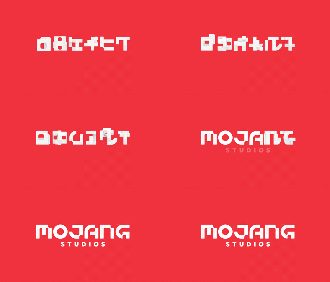
Mojang rebrands itself, celebrating Minecraft’s 11th anniversary

In 2009, Mojang Specifications rushed into the gaming market with Minecraft, a sandbox video game which broke all sales records and was considered as “the video game of all times”. One year ago, Minecraft celebrated its tenth anniversary by releasing the Exhibition in Seattle edition, free anniversary map and other special features. This year, to celebrate the 11th anniversary of the game, the developing company has rebranded itself as Mojang Sudios and rolled out a new logo. According to Thomas Wiborgh, Mojang’s creative department chief, the rebranding marks the studio’s evolution from a small enterprise in Stockholm to a “multi-location…

Coltex Australia rebrands as Ampol and rolls out new logo

Gaining its independence from Chevron in 2015, Australia’s Caltex had been using the US oil corporation’s brand name for more five years. As Chevron’s brand license terminated in late 2019, Coltex Australia is going to change its name to Ampol and adopt a new logo. The Australian oil company unveiled its new emblem on May 13th, a day before the annual meeting that has to approve the rebranding. As Coltex’s interim CEO Matthew Halliday said, the renovation of the company’s look takes place at an appropriate time as it only emphasizes the recent growth of the firm as a leading…

British Geological Survey updates its identity

Founded in 1835 by Sir Henry Thomas De la Beche, the British Geological Survey is the world’s oldest institution for geoscientific researches. The organization’s competences include giving advices to the government of the United Kingdom on all issues of the geological science, and also informing people about matters of geology. To refresh its look, the BGS has recently rolled out a new visual identity that, according to a press-release, is intended to reflect a safer environmental future. To draw up its new brand, the BGS collaborated with ThreeRooms, a Nottingham-based design agency, that had excellently figured out the way to…

Australia gets new national brand and refreshed Australian Made logo

The National Brand Advisory Council of Australia, a body that is committed to develop a national brand for the country, has presented a new logo which will be symbolizing Australia and help national institutions and businesses promote the Australian culture and products. Although Australia is strongly associated with the kangaroo and this marsupial is the unquestionable symbol of the country, NBAC decided not to follow simple clichés and chose golden wattle as a central image for Australia’s brand. Within the country, wattle is considered a national symbol, just like the kangaroo or emu. In the new logo, the flower is…

Google updates its Photos service with new logo

We’ve already got used to the fact that companies make their logos simpler and flatter. One more example of this trend has recently been presented by Google. Releasing a new version of its Photos app, the web giant has also shown a refreshed icon for it. Those Android and iOS users, who have updated The Google Photos pinwheel has received a roundier design. Keeping their colors – red, blue, green and yellow – but in lighter shades, its blades have become half-circular, and as they don’t have the two-tone shades, which were in the previous emblem, the new logo looks…

National Instruments rebrand as NI, rolling out new logo

Maybe, not so many people heard about National Instruments, but, every day, we meet such names as 3G, 4G LTE, and 5G. All of these mobile technologies were created with use of the means developed by NI. Incidentally, the abbreviation “NI” became widely used among the engineering society and turned into a kind of a brand. That’s why the company made a decision to officially rebrand itself as NI. It is worth to mention that the rebranding was preceded by a wide-scale reorganization of the company. National Instruments were divided into several units, and new divisions for machine learning, data…

Dustin: Unstoppable moving

Founded in 1984, the Swedish brand Dustin started as small company selling hardware devices over mail order. Over time, through a number of acquisitions, it turned into an international firm with subsidiaries in Norway, Denmark, Finland and the Netherlands. As of today, Dustin, with a stuff of over 1,800 workers, offers its products to businesses and ordinary customers. To emphasize its growth, the brand has recently updated its identity. Dustin’s new look was forged by the Stockholm-based international agency Kruppa Hosk. The design project under the motto “We keep things moving” aimed to create a brand identity that would reflect…

More