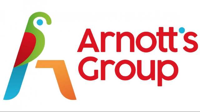
Category: News

共有 416
Facebook updates Messenger’s logo in the Instagram style

It seems that Google is not alone in trying to unify the brands in terms of visual identity. This idea is likely supported by Facebook that has recently unveiled an updated logo for its Messenger app, as the design of the new emblem resembles the While the logo’s general forms, including the central bolt, have remained the same, the change concerns the logo’s coloring. Switching from blue to gradient of blue and pink with some orange hues, the icon really reminds of the colors of the Insta’s camera. Although an announcement from Facebook says nothing about the connection between the…

Google presents new logos for its G-Suite services

It turned out to be that The unifying design motifs are Google’s four-color scheme and the color overlapping in the corners of the icons that makes them perceived a bit three-dimensional, albeit it doesn’t eliminate the flat look in general. Also, we can notice that the corners themselves have grown more rounded. This is particularly evident in the Google Drive logo. In addition, it is the only emblem of the five which maintained a three-color palette (yellow-green-blue) in its previous version, and adopted only a red corner in the new iteration. At the same time, the most changes can be…

AO: New smile, new style

Started from a bet between two close friends in 2000, AO (formerly known as Appliance Online) has grown into the largest online household appliance retailer in the United Kingdom. In the 2010s, the company was strongly expanding its activity in Germany, the Netherlands and France. Seven years ago, it rebranded as ao.com and received a logo featuring its lowercase initials and a semicircle that made it look like a smiling face. Although its visual identity was quite recognizable, the company felt that it’s a bit dated, making the business lost amid its competitors. To carry out a “long overdue facelift”…

Casey’s General Store rebrands itself as Casey’s, rolling out new logo

Casey’s General Store, a gas station and convenience store chain operating in 16 states in the Midwest, is changing its look for the first time since its inception in 1959. Realizing that its name is too long and its logo is too complicated for 2020, the company has shortened the former to just Casey’s and simplified much the latter. According to Casey’s, the rebranding was preceded by a research which showed that the “General Store” was unclear for younger customers, and the logo, representing a big barn with the company’s name in serif fonts and a weathercock on the top,…

Google is about to replace Gmail logo

For a number of years, Google has systematicly been changing the logos for its online services, making a consistent visual brand range. Now it’s time for Gmail as the company has released a teaser demonstrating the outlines of the upcoming While the teaser can’t be considered as an official announcement, it’s worth noting that the Gmail emblem is a rare Google logo which doesn’t maintain Google’s yellow-red-blue-green color palette. So, it won’t be a big surprise if Google’s mail service will officially receive a new logotype to be more coherent with the other products of the company. As you can…

Ottawa Senators bring back old logo slightly altered

Last week, the According to Eugene Melnyk, the franchise’s owner, while restoring the side-view depiction of the Roman legatus, the Senators are returning to their roots. This emphasizes that the team has strong heriage, and their goal is to build something new and bold on it and to start a new chapter in their history. The revived logo still features a couple of small details that distinguish it from the vintage Senators emblem. The legionary now has a gold cape instead of the red one that was in the original version – probably, the change was done to look more…

A new logo to help the world understand electronics recycling

Growth of waste is one of the biggest issues of the present. According to some researches, the most quickly increasing waste stream today is electronic waste (or e-waste). Over 50 million tonnes of e-waste are produced in the world every year, but less than one fifth of it is designated for recycling. To draw public attention to the problem, Material Focus, a British organization advocating electronic waste recycling, has introduced a logo that is supposed to mark e-products to be recycled. The logotype is a result of Material Focus’ cooperation with the London-base design studio Truant, established as a part…

Intel makes changes in its look

Since its inception in 1968, Although it dropped the swoosh, Intel’s new logotype inherits general traits from the previous emblem, including the square dot over the “i” (however, its color will be different from the color of the letters now) and the sans-serif style for the letterforms which, however, were a bit altered with the right corners in the “i” and the “l” as well as a more traditional shape of the “n”. While presenting the new brand identity in her corporate blog, Karen Walker, Intel’s Senior Vice President Chief Marketing Officer, said that the rebranding is based on the…

More