Category: News

共有 416
Olivetti presents Made in Italy logo

Olivetti, founded in 1908, has changed its logo. With a new color scheme, the Italian manufacturer of computers, tablets, smartphones and other hi-tech products aims to emphasize the fact that “Olivetti” stands for the “Made in Italy” products. Olivetti crucially influenced the design in the 20th century, especially in industry and communications. As early as 1950s, the company’s design of typewriters and calculators, developed by Marcello Nizzoli, was so innovative that the Museum of Modern Art in New York held an exhibit entitled “Olivetti: Design in Industry”. Later, the products, created by Ettore Sottsass, such as the Valentine typewriter, formed…

Zoopla: Journey Lines of house buying

Founded in 2007, Zoopla is one of Britain’s largest web-services providing users with the information on house sold prices, area trends and current real estate prices in the United Kingdom. Over 14 years, the company has created an extensive system of searching, price comparison and valuation estimates for residential properties. To refresh its image, hoping to show complicated processes in the real estate business, Zoopla has updated its visual identity. Zoopla’s new brand look was developed by a joint team of the company’s in-house design department and the Glasgow-based design studio Zag. According to Neil Cummings, Zag’s creative director, the…

UEFA presents logos for Europa League and Conference League

Reducing the Europa League from 48 to 32 teams and launching the Europa Conference League from the 2021/22 season, Turquoise had experience working with the European football union earlier when the studio “built a good understanding of the requirements and needs”, as its creative officer Gareth Mapp says. Developing the UEFA leagues project, Turquoise tried to refresh the UEL branding with a new design which could tell that the league will show more competitiveness even with fewer teams now. With this, the Conference League’s logo should reflect the ideas of openness and inclusiveness. Both logos share a general design including…

National Gallery of Canada unveils Algonquin-inspired logo

The National Gallery of Canada has presented its new visual branding that was developed with the involvement of the members of the Algonquin Anishinabeg Nation. The NGC new logo, designed in new corporate colors, is a part of the inclusive process launched accordingly to NGC’s strategic plan which was announced early this year. The revision of the gallery’s orientation and values reflects its aspiration for decolonization. To create its new visual identity NGC carried out numerous consultation with more than 300 persons including Algonquin elders as well as young indigenous artists. The NGC marketing vice-president Rosemary Thompson says: “We are…

Renault Group finally rolls out new Dacia visual identity

In February, we could see an So, the mark says goodbye to the chrome-like emblem which was introduced in 2008. Instead, href=”https://www.picpapa.com/dacia-logo”Dacia will use a symbol made up of the abstractly stylized letters “D” and “C”. The geometric typography, purposely diminished, reflects Dacia’s essence and designates the most important things in the car industry, according to the company. The merging letters convey the feeling of movement due to their arrow-like shape. Earthy colors will prevail in Dacia’s visual identity. The green khaki is chosen as the main brand color. It is intended to emphasize the “street spirit” of the mark…

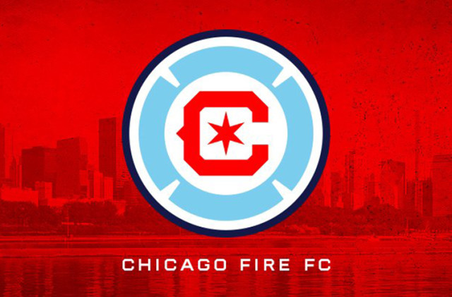
Chicago Fire restores Florian Cross for new crest

In November 2019, the Chicago Fire carried out the The big “C” in the center, the team’s another revived symbol, is now designed in a cornered style, but still keeps the iconic spike, while the six-pointed star is pretty similar to the stars in the Municipal Flag of Chicago, being an echo of the 1998 crest’s ring with six point. The colors of the cross, “C” and star are also a replication of the colors of the city’s banner. Overall, the Fire’s new crest can be called a distinctive and laudable move as the team return to their roots in…

Edmonton Eskimos rebranded as Edmonton Elks with new logo

The Edmonton Eskimos, playing in the Canadian Football League, have rebranded as the Edmonton Elks. Renaming themselves, the team meets numerous requests from indigenous people’s organizations arguing that the “Eskimo” has a controversial connotation. Alongside the new name, a new logo has been presented as well. The rebranding process began last November when then called Eskimos launched an online campaign, asking people to choose a new name for the team. In four months, a list with more than 2000 proposed names was shortened to seven. A final survey among the club’s players, couches, stakeholders and fans, with some advice from…

Cologne Cathedral gets its first-ever logo

There are a lot of institutions in Cologne, Germany, whose logos depict the famous Cologne Cathedral – from the city’s administration to the fire department. The cathedral’s two towers are just omnipresent in the Rhineland’s capital. One more “Domspitzen” logo appeared a few days ago, and this is the first-ever logo of the Cologne Cathedral itself. Exactly three years ago, the Archdiocese of Cologne, that is a managing body for the cathedral, announced a competition for a corporate design which was won by the design agency Jäger&Jäger. Starting in late 2019, the agency has recently presented the result of its…

More