Category: News

共有 416
Eftpos updates visual identity

Australia’s Eftpos (Electronic funds transfer at point of sale), a popular e-payment system, has rolled out its new visual identity, updating the logo and brand colors. The rebranding is intended to show the recent digital innovations of Eftpos. To create its new look, the payment brand collaborated with Hulsbosch, a Sydney-based design studio. Hulbosch’s work resulted in a new Eftpos symbol which represents a big “e” formed like a curved band. Colored in Raspberry red (a brand color from now) with some other shadow hues, the letter is accompanied by an Eftpos wordmark in a lowercased typeface, featuring connected “f”…

Swarovski adopts new visual identity, openning new stores worldwide

Crystal brand First of all, the fresh design’s leitmotif can be seen in the updated Swarovski logo. The iconic swan in the new iteration is facing to the right, featuring a more elongated neck and two wings, more clearly drawn compared to the old one-wing version. The brand chose the swan as its emblem in 1988 as a symbol of everlasting love and nature’s beauty, the notions that have always been associated with Swarovski’s crystal glass and jewelry. For the logo, the swan has been placed into an octagonal frame that symbolizes a faceted crystal as well as the idea…

Google Fonts gets new logo, expanding its catalog

Google Fonts, a font library launched in 2010, has received a new logo. As with The font library, previously known as Google Web Fonts, has long been a web standard. Ten years ago, the benefits of web fonts still had to be explained, while today the fonts, available on the service, are a usual part of web-sites. At the moment, Google Fonts offers 1043 font families that can be used for web-pages as well as print products. According to Google’s Material Design blog, the icons, created within the Material Design project, are also included in the Google Fonts catalog. So,…

New branding for American Library

Founded in 1963, the American Library (formerly known as the 2nd Air Division Library) is an institution established to honor the US Air Force troops who fought in Europe during WWII. Located in Norwich, UK, the library contains a collection of materials dedicated to the USAF, American relationship with Britain and American culture in general. Adopting its current name, the American Library was looking to a new visual identity as well. The institution’s brand, including a logo, printed materials and some merchandise, was renovated by The Click, a Norwich-based design studio. In the brand creation, the designers started from the…

Peugeot unveils new brand logo symbolizing upmarket move

On February 25th, While the logo was announced ten month ago, and its details have been kept a secret during this time, it will mark the hood of the Peugeot 308 that is going to be presented in March. According to the company, the emblem was influenced by the logo of the 404, which was produced in the early 1960s, and especially by that one noticed on the e-Legend concept the manufacturer presented at the 2018 Paris Auto Show. Peugeot has saved the overall design of the lion, but it has abandoned the detailed forms, giving the emblem some dynamic…

Varta updates its logo

Founded in 1887, Varta is a German company manufacturing batteries for global consumer, industrial and automotive markets. Celebrating the most successful recent year in its history, the brand has announced a new logo as well as a renovated brand strategy. The Ellwangen-based battery company is staying in the fast lane. With its record high share price and top income last year, Varta shows a great development dynamics even after 135 years since its inception, and now this success is getting an additional impact with a new emblem and an updated brand policy. While Varta has previously had the slogan “In…

Poco unveils its new visual identity

In January of 2020, Xiaomi’s Indian subsidiary Poco declared its independence from the parent company, claiming it would have its own team and much more. To celebrate its first successful year as an independent enterprise, the brand has announced its new logo and mascot that can be another evidence of the fact that it is trying to set itself apart from the Chinese manufacturer. The new mascot is essentially based on the angry/mad emoji with addition of a kind of a growling mouth, halo as well as Android robot-style antennas. Sharing the explanation for all these elements, Poco says that…

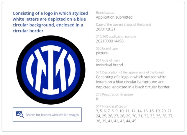
Inter Milan’s new logo leaked

Over the last couple of weeks, people on the web have been discussing a photo of a pre-match jacket with an allegedly new logo of The new Inter logo retains the overall design of the team’s traditional symbolism, that appeared with the club’s founding in 1908, as it features the interlacing “I” and “M”. However, it lacks the current emblem’s “F” and “C” standing for “Football Club”, and that may be a hint that Inter Milan can really be renamed. While team’s full name in Italian is now Football Club Internazionale Milano, it’s not ruled out that its short version,…

More