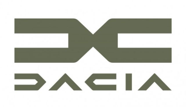
Category: News

共有 416
AT&T and Discovery present merged Warner Bros. Discovery logo

Last month, The name and visual identity for the company were presented by Discovery’s CEO David Zaslav, who will also be the head of the emerging venture. Warner Bros. Discovery’s logo represents a 3D wordmark designed in gold which is associated with the iconic WB shield. It is complemented with the slogan “The stuff that dreams are made of”, a phrase taken from the 1941 href=”https://www.picpapa.com/discovery-logo”Warner Bros. movie “Maltese Falcon” – this is an additional respectful nod to the rich heritage of the studio, giving a hint what we should expect from the company. While the emblem’s design has already…

Total officially rebrands as TotalEnergies, rolling out new logo

On May 28, at the Annual general meeting, the French petrol company At the meeting, Patrique Pouyanné, the head of the company, whose term of office has been extended for three years, also presented TotalEnergies’ visual identity that has to illustrate the petrol giant’s transformation into a “multi-energy company”. The new logo represents stylized initials of the company’s new name. The TE emblem is distinguished with colorful and quite a simple design which seems drawn just with one finger. It is accompanied by the wordmark “TotalEnergies” introduced in March as an interim logo. For the official release, it received a…

DesignStudio creates new “squiggly” visual identity for Mind charity

Founded in 1948, Mind is a mental health charity operating in England and Wales. It gives support for people with mental disorders, offering information and advice, and also lobbies governmental and municipal institutions on mental health issues. Recently, the organization has refreshed its visual identity to show more clearly its focusing on social changes. To overhaul its branding, Mind hired DesignStudio that updated the charity’s scribble logo and developed some other brand features, basing on Mind’s traditional imagery. The studio has worked on this project for more than a year, starting even before the first lockdown had been declared in…

Angers SCO changes logo as Stéphane Moulin retires

Lately, changes of logos have become regular and make a lot of noise, like those of Juventus or Inter Milan. Such rebrandings often aim to develop the club image, and we know that today, people play football off the field too, holding huge marketing stakes. However, crest changes are not executed just with a twist of the spanner – usually, this is a sign of an upcoming new era. And that is the case of the So, the Angers’ updated logo shows a new turn in the club’s journey led by Said Chabane now. If fans are afraid to see…

England’s Football Association presents England Football brand

The world’s oldest European football organization, the Football Association of England has launched a new brand reflecting its aspiration to unify all levels of the sport – from the managing bodies to the ordinary players. Named England Football, the new brand was visually designed by Matta, a design studio from London. Inspired by the Royal arms of England and the FA crest, the England Football logo depicts a lion, lioness and cub. According to Louis Swann, Matta’s creative director, this has to symbolize men’s teams, women’s teams and youth teams. The emblem’s red color, which is described as “striking red”,…

Colubus Crew change name and logo, causing backlash from fans

Last year’s winners of the MLS Cup and US Open Cup, the The crest of the Columbus SC features a big white letter “C”, symbolizing its original name and home city. Formed like a shield, it is distinguished with swallowtail bottom, referring to the flag of Ohio. The burgee logo is also accompanied by the letterings “Columbus” on top and “SC” between the lower ends. It retains the team’s traditional colors through the black background and yellow bordering. Apart from the main emblem, the Columbus SC also presented alternate symbols for the team including a checker flag formed like the…

Groupe Renault rebrands as Renault Group, rolling out new visual identity

Renault Group, that owns such car brands as Renault Group introduced its new logo as a part of the Annual general meeting. According to the company’s representatives, Renault is in the process of transformation, and with the new name and proper visual identity, the management is setting the goal to strengthen the group’s profile. As the automaker’s press-release says, mobility for addressing social issues is important now than ever before, and now the company’s power and dynamism depend on the strategy oriented to meet the contemporary challenges. Positioning itself as an international group, the company officially adopted the English name…

Flower City Union gets logo

Last December, the National Independent Soccer Association announced the league would be joined by a team from Rochester, NY, named Flower City Union. Getting ready to start playing in the 2022 season, the soccer team has recently presented their logo created by Christopher Payne. As the Rochester Rhinos, who played in the United Soccer League, indefinitely took a break in 2017, the city was left without a professional soccer team. So, several enthusiasts for the game, including the Rhinos’ former chief business officer, decided to resume soccer life in Rochester, founding the Flower City Union. The team draw their name…

More