Category: News

共有 416
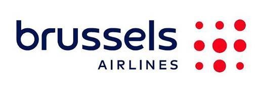
Brussels unveils new, but not original logo

Owned by Germany’s Brussels Airlines’ new logo inherits a dot motif from its previous emblem that represented a lowercase “b” made up of red dots. Now, the company’s symbol is nine red dots of different sizes. The wordmark has been redesigned as well, featuring a bigger “Brussels”, still lowercase though, and an uppercase word “Airlines”. Commenting on the logo, Brussels Airlines said it regards its new brand identity as a symbol for the future of the company. The company aspires “to reinvent itself”, expanding its fleet with new A320neo planes and digitalizing its services. However, the rebranding was not without…

Mercedes-Benz celebrates 100th anniversary of its three-pointed star logo

Exactly 100 years ago, in November 1921, Daimler Motoren Geselschaft, a predecessor of While DMG applied to the patent office in November 1921, the trademark was officially registered in August 1923, and the grooved radiator cap on the hood turned into a footstall for the Mercedes star. A bit later, the circled star appeared on other parts of light and commercial vehicles. Interestingly, the star itself, without the circle, had been known for a good decade at the moment, as DMG patented this sign in 1909. Formed after a merger between DMG and Benz & Cie., Daimler-Benz AG also merged…

A logo for the 2023 FIFA Women’s World Cup unveiled

FIFA has recently presented a logo and a slogan for the next Women’s World Cup that will take place in Australia and New Zealand in 2023. According to the football association, the logo and the whole brand identity symbolize not only the fact that the world’s best teams will be brought together in one place but also the spirit and values of the two host countries. In June 2020, FIFA announced that Australia and New Zealand would share the 2023 Women’s World Cup. The event will be the first women’s world football championship that will be held in the southern…

Kawasaki adopts River Mark as brand logo

The Japanese motorcycle brand For many in Japan, Kawasaki is another word for a motorcycle. The brand is backed by Kawasaki Heavy Industries, Ltd. which has continuously been growing since its inception in 1878. The business group is also involved in shipbuilding, aerospace engineering, civil and industrial construction. A couple of weeks ago, the corporation announced that it would manage its motor branch through a separate company named Kawasaki Motors Ltd. The division is given more autonomy keeping in mind the special “business-to-customer” characteristics of the enterprise. . The River Mark was used in the key moments of the company’s…

Ferrari rolls out its 75th anniversary logo

As For the 75th anniversary emblem, Ferrari’s iconic prancing horse was incorporated into the big number “75” accompanied by the dates “1947-2022”. The logo is designed in red and white which are traditional colors of the brand, associated with Ferrari sports cars. It will be displayed at the special events the company will organize throughout 2022. The “Cavallino Rampante” was also embodied into a sculpture made up as a puzzle by Ferrari specialists. It symbolizes the essence of Ferrari as well as the history and future of the brand, as the company’s chairman John Elkann said. 2022 is not just…

Alaska’s Peter Pan unveils new look

Acquired by a US-based venture from Maruha Nichiro a year ago, Peter Pan Seafood Co., headquartered in Anchorage, Alaska, has unveiled a new visual identity to celebrate its first year under American ownership after being a part of the Japanese corporation for more than four decades. Founded in 1898, Peter Pan has been a leading seafood company in Alaska for a long time. Its name is said to be adopted in the early 20th century when the then owner of the company had watched a Peter Pan stage play, being impressed much by the story of the mischievous young boy….

Avelo: Inspiring travel

Originally founded as Casino Express Airlines in 1987 and being named Xtra Airlines for some time, Avelo Airlines received its current name early this year after a change of ownership. Headquartered in Houston, Texas, the re-established airline operates in the ultra-low-cost segment, having a fleet of six next-gen Boeing 737 planes. Declaring its main purpose to “Inspire Travel”, the company has rolled out its visual identity created by the Kim Berlin design studio. It should be mentioned first that the design studio has made great efforts, developing the whole brand identity for Avelo Airlines – from the naming to the…

Norton refreshes its logo

Norton, a brand owned by software developer NortonLifeLock Inc., is known for utility applications as well as the Norton Security anti-virus program. Recently, the software brand’s visual identity was refreshed to position it as a “digital ally for customers”, offering a modern and comprehensive design. The Norton products are developed by NortonLifeLock which, in turn, is a part of the software company Symantec. As the company’s press release says, the rebranding marks a new era for Norton. Like people and life, the Norton brand and its products have been developing over the last twenty years. Digital life means just life…

More