Category: News

共有 416
Magnolia Network makes its cable debut with original visual identity

Three years ago, Chip and Joanna Gaines, who hosted the Fixer Upper series on the DIY Network, announced they would launch a new broadcasting company in cooperation with Named after the previous company of Chip and Joanna they have in Waco, Texas, the Magnolia Network will carry a refreshed programming, focusing on documentary series related to home repair and renovation. The network will broadcast under an original visual brand connected with the Gaines’ agricultural business in Texas. The visual identity for the Magnolia Network was created by the New York-based design agency Loyalkaspar that has a lot of experience in…

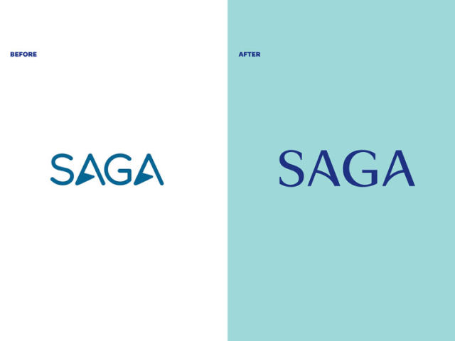
UK’s Saga Group presents new visual identity by SomeOne

Established in 1951, Saga Group is a British company offering insurance, travel, financial services for people who are over the age of 50. Through its divisions, the enterprise provides holiday tours, a wide range of insurance products, credit cards, saving accounts, and much more. Marking over 70 years of its journey, Saga has updated its visual identity forged by one of the UK’s most prominent design agencies SomeOne. Involving Saga’s employees and customers into the rebranding process, the SomeOne team worked out the basic principles for the new look of the company that should convey, among other things, the idea…

Nivea: Rejuvenating the brand

The personal care brand First thing to notice in the new logo is a lighter shade of blue. On closer examination, you may also see some changes in the wordmark which is designed in a thinner font now, and this makes the spaces between the letters visually larger. Compared to the previous version, the lettering looks airier. Nivea is one of the few brands that copyrighted its branded color. The Nivea Blue (Pantone 280 C) is registered as a trademark since 2007. However, the status of the new Nivea blue is not clear yet. Anyway, the fact that the redesigned…

Eredivisie’s Willem II updates its logo

Playing in the Netherlands’ football top division Eredivisie, the Willem II is approaching to its 125th anniversary the club will celebrate next season. On this occasion, the team has updated its logo. The new emblem, which is the sixth iteration in the club’s history, was created, considering the traditional symbolism of Willem II as well as the long-time wishes of fans to return to the logo basics used from 1952 to 1983. The traditional colors of the team from Tilburg have always been red, white and blue, accordingly to the Netherlands’ national flag. Based on this fact and the design…

Radio France: New campaign, new look

Radio France, a French broadcasting public company, has presented a new branding as well as new programming logos as it is launching a nationwide campaign. The French broadcaster is currently expanding its digital offerings, promoting them with a special campaign. Under the motto “Entrez libre” (“Enter freely”), the company is planning to create, on the Radiofrance.fr platform, an alternative to the media services which became popular in recent years, as an official press release says. “Entrez libre” is an invitation for listeners to discover the lively worlds of seven radio channels and four musical communities, according to Radio France. An…

EFE: Seriousness and credibility

Founded in 1939, EFE is a Spanish news agency that is the world’s fourth-largest wire company after Associated Press, Reuters, and Agence France-Press. The media corporation manages press, radio, TV, and web services. Having a staff of nearly 3,000 employees, EFE operates in 120 countries. To refresh its corporate image and emphasize its position in the global media industry, the agency has launched a new brand logo reflecting steadfastness, dynamism, and modernity. This is the fourth EFE logo update in the 83-year history of the company. According to the agency’s president Gabriela Cañas, the rebranding has been a natural process,…

Capcom presents Street Fighter 6 logo looking like a clipart piece

The Japanese game publisher recently present a teaser for Street Fighter 6. Although the developer showed a little of the upcoming game, the fans of the franchise got an opportunity to look closely at its logo. Some of them noticed that it looks like a stock image, and they turned out to be right. Street Fighter 6 will be the last game of the long-time series which became well-known, including for its logos. They perfectly conveyed the feel of game fightings as well as martial arts movies. They were bright, bold and crazy. However, the latest SF emblem was described…

Sanofi introduces a new logo

Originally founded in 1973, Unveiling a new logo, the corporation is aiming to unite “many cultures, identities and brands” under a single trademark. Making this step, Sanofi has great plans for the future, as a press release says. Sanofi’s previous logo was introduced in 2011. This round emblem that was called The Bird of Hope gives way to a lowercase wordmark. The corporate colors were changed as well – instead of a green-and-blue palette, the company will use purple as the only brand color. As for the new logo, it was inspired by “simple and moving-oriented codes of the technological…

More