Category: News

共有 416
Pro14 rebrands as United Rugby Championship with new visual identity

Extended with two more clubs from South Africa to 16 teams, the Pro14 rugby league has changed its name to United Rugby Championship. Apart from the South African teams, the competition includes teams from Scotland, Ireland, Wales and Italy. Preparing to start the next season under the new name in September, URC has also unveiled a new visual identity. The league’s new look was developed by Thisaway, a branding agency from Bath, Somerset. The URC branding project, entitled “A different league”, was inspired by the fact that the transformed competition brings together teams from different cultures. In their work, the…

NBA rolls out its 75th anniversary logo

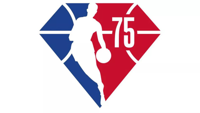
NBA is celebrating its 75th anniversary next season. And it was to be expected that the association would present a special logo to commemorate this date. However, the anniversary emblem, that was unveiled a few days ago, appeared to be a disappointment for some fans as it is based on the current For the new logo, the iconic Jerry West silhouette, against a blue-and-red background and a basketball pattern with the number “75”, was placed into a diamond shape. Some people suggest that the diamond form may probably be inspired by the term “Diamond wedding” that is celebrated after 75…

Marc O’Polo unveils its new sustainable look

The fashion brand Marc O’Polo was founded 1967 in Stockholm by Swedes Rolf Lind, Göte Huss and US citizen Jerry O’Sheets. For its apparel collections, the label have always preferred natural materials. Since the transfer of its head office to Stephankirchen, Germany, in 1997, Marc O’Polo began an intensive expansion to international markets. While going to celebrate its 55th anniversary next year, the company has revised its logo, colors, typography and marking. The goal of the rebranding is to make the brand more attractive for the customers. Marc O’Polo’s renovated look was developed by the Munich-based design agency Wiegand von…

BBC slightly redesigns its logo for “tens of thousands of pounds”

The British Broadcasting Corporation has updated its logo. However, the new iteration hardly shows considerable changes. The slight redesign of the In fact, this design has already been used on the corporation’s streaming service BBC Select launched in the US and Canada this February. However, the innovation went unnoticed then. Although BBC’s representatives said that the costs of the redesign were not so significant as it is supposed to be, the refreshed logo with its minuscule changes was stigmatized as a waste of taxpayers money. It was also named a bad parody of the current emblem. At the same time,…

New Zealand Post rebrands with new logo

New Zealand Post, a state-owned post enterprise of New Zealand, has updated its visual identity as a part of its new corporate structure. Some products and delivering services of the company, including NZ Post, CourierPost and Pace, have been united into a single division under the brand NZ Post. Until recently, the post services, included in the New Zealand Post’s service package, have been offered under different brands as a result of acquisitions and launches of some businesses. According to the company, it has long aimed to unify and simplify the look of its services. The enterprise’s logo, presented as…

Black American Television updates its logo

Celebrating its 40th anniversary, the Black Entertainment Television (BET) targeting African American audience  has rolled out its new visual identity that marks a new stage in the history of the channel. The new BET branding, including a logo, was presented at the 2021 BET Awards ceremony. According to the network, it is a key move for its image, paying tribute to its 40-year journey and heritage of the Black excellence. Through the years, the BET abbreviation and a star have been customary elements of the channel’s logos designed primarily in a black-and-white gamma. While the previous emblem represented a straight…

Old War Office turns into luxury hotel with new brand identity

Located in London’s Whitehall, the building known as the Old War Office was used as the headquarter of the UK’s war department from its completion in 1906 to 2014. After the reformed Ministry of Defence had moved to the Main Building, the OWO was sold to Hinduja Group which announced that the building would be converted to a kind of a luxury hotel with residential apartments. Aiming to develop the image of the new hotel, the owners hired design agency Greenspace that created a branding involving the OWO’s history as well as graphic motifs from the early 1900’s. Despite today’s…

SIJHL presents new logo and 20th anniversary emblem

Founded in 2001, the Superior International Junior Hockey League has rolled out its new logo and 20th anniversary emblem. As the league’s previous insignia, the new one unites the patterns of the US and Canada flags as the junior A circuit brings together teams from both countries. Introducing SIJHL’s new logo, Darrin Nicholas, the league’s commissioner, said that 20-year journey is a good reason to bring some changes into the visual identity of the league. For the rebranding, the league’s management held a competition among local designers and artists associated with SIJHL and the teams. And it was won by…

More