Category: News

共有 416
Sydney Swans adopt new logo, getting rid of the Sydney Opera House

Launched in 1874, the Sydney Swans are an Australian rules football team playing in the Australian Football League. Until recently, the club used an emblem that featured the recognizable silhouette of the Sydney Opera House. However, in the wake of discussions about the rightfulness of using landmarks for logos and trademarks, the Swans have taken decision to change their own insignia. While the club’s old logo, along with the Opera House, included a swan, a big swan’s head is a main element of the new one. Although the famous symbol of Sydney was removed, we can still see a slight…

DocMorris: A new logo for a new business scheme

Founded in 2000, DocMorris is one of the largest online mail-order pharmacies in Europe. With the annual income of $50 millions, it operates in Germany and the Netherlands. Transforming from a simple online pharmacy to a digital health care provider, the company has recently changed its brand identity. While many things have been done to digitalize its health care services, DocMorris is saying goodbye to its old logo with a cross symbol it has used since its inception. As the pharmacy’s press-release says, with growing expectation of customers, digitalization can be a driver for a health care service to enter…

Pfizer: Patients and science

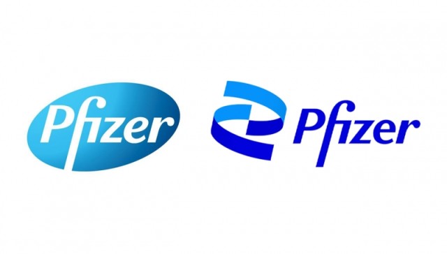
Amid the COVID-19 pandemic, Actually, the work on Pfizer’s new brand look began before the pandemic broke out. Two years ago, the company applied to Team, a Brooklyn-based design agency, to carry out the rebranding. The studio developed a new Pfizer logo and visuals reflecting the drug manufacturer’s heritage as well as its important role in struggling against the most challenging diseases. Considering the iconic status of the Pfizer emblem, Team tried to keep its basic elements, adding new ones based on the recognizable oval pill. Thus, two spiral bands were created as a symbol of Pfizer’s aspiration to people’s…

Burger King comes back to its vintage logo

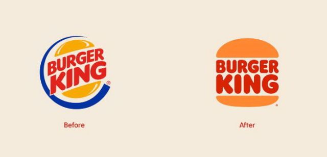
According to the company’s press-release, the updated logo with its minimalistic design reminds of the seamless evolution of the brand, while paying homage to its rich history. Copying Burger King’s vintage logotype in general, the new emblem, nevertheless, is distinguished with more intense colors, a bit reshaped bun halves and a new custom typeface called “Flame” whose design is intended to reflect the chain’s “bold, rounded and yummy” food. As Burger King’s chief creative officer Rafael Abreu said, the chain decided to get back to the vintage design as it is the best visual reflection of Burger King, being a…

General Motors unveils new logo symbolizing electocar priority

Last week, Overhauling the iconic GM trademark, the company tried to express its new path of production, the ideas of eco-friendliness and the technology implemented in electric vehicles. In renovated logo, the GM initials have become lowercased, placed inside a frame with rounded angles. The emblem’s milder and a bit three-dimensonal design with its light blue gradient color give a modern perception and symbolize clean environment and blue skies that people will have, using EV’s. Another remarkable change is the underline that was featured in the previous GM logo – now it is only under the “m”, and the space…

CIA updates its logo, implementing new recruitment policy

The first big rebrand of 2021 unexpectedly comes from the Although CIA’s revamped emblem still represents a roundel, it features an entirely new design, distinguished with wave-like patterns with multiple intersecting white lines against a gray background. It also includes the centered wordmark “CIA” and triple circular lettering “Central Intelligence Agency”. This is a really unusual design solution for such a solid governmental institution which previously used a seal in the style of the State symbols. This cliché-breaking move of CIA perfectly reflects the new recruiting and diversity policy, in which the organization aspires to enroll young and talented Americans…

Petco removes cat and dog from logo, making consumers outraged

Enjoying a decent sales growth over last two years, Petco has large-scale business plans with a more orientation toward health care for pets. The pet retailer already announced it would expand its chain of veterinarian clinics up to 140 locations by the beginning of 2021, and the process will likely be continued. Aiming to establish itself as a solid pet health care provider, Petco has recently rebranded itself as “Petco, The Health + Wellness Co”, replacing its cat and dog logo with a new one featuring only the company’s new name. However, the brand overhauling faced a harsh criticism. Mews…

Foursquare updates its brand identity

Launched in 2008, To overhaul its look Foursquare hired PlayLab, a Los Angeles-based design studio, that developed the service’s new identity based on its activities and current level in terms of business and technology. While the previous Foursquare logos looked quite generic, featuring a cartoon character or representing a simple lettering (in the latest iteration), the updated visual identity of the service includes a new wordmark in the Authentic Sans 90 typeface, complemented by the FSQ abbreviation. As David Godycki, the art director of Foursquare, says, this design creates a scalable system retaining the company’s traditional playful style. In addition,…

More