Blog

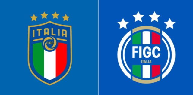
Italian Football Federation receives new logo

This week, the Italian Football Federation (FIGC – Federazione Italiana Giuoco Calcio) has rolled out its new logo at a special presentation event in Milan. The old emblem introduced in 2017 will stay in use but not as an official symbol of the union. The shield logo adopted four years ago has so far served as an insignia for both the federation and national team. Since now, as FIGC declared, the two bodies will use different visual identities. While the previous logo will be reserved for the national teams, the institution will appear in public with a round emblem. ….

Go.Compare: Singing cheerfulness to help

Go.Compare, a well-known financial service comparison website in the UK, is expanding its range of services to include home insurance, high-speed internet connections, and other features. Despite the company’s existing popularity, it has recognized the necessity to update its visual identity in order to remain competitive in today’s market. The rebranding of Go.Compare was entrusted to Ragged Edge, a London-based studio known for its works for technology companies like Kili and Omlet. The primary objective of the studio was to reinforce the platform’s already established reputation. The new look aims to enhance data accessibility without requiring additional search efforts. The…

Sears updates its controversial logo, harshly again

Established in 1893 as a mail ordering catalog company, Sears had been one of the leading US department store chains for a long time until it began to concede the top positions to Walmart and other popular retailers. After winning its bankruptcy auction a year ago, the company changed its identity by rolling out a logo that was much criticized for resembling the emblem of While renewing its visual brand in May 2019, Sears wanted to add motifs of warmth, home and heart to its identity, but when the company had presented its new logo, people noticed that it reminded…

New Zealand’s apple brand receives new design

The brand Jazz Apple, owned by the New Zealand fruit & vegetable manufacturer T&G Global, has got a refreshment. The certified Jazz apple cultivar is also available in the UK, US, Australia and the EU countries. Now, the brand is to stand out from the crowd with a new premium apple type. The Jazz apple cultivar, which is a cross between Braeburn and Royal Gala, has been present on the market for 25 years. As T&G Global explains in its press-release, the way customers choose foods has changed. When it comes to snacks, customers pay more attention to healthy nutrition…

Omlet: Tender loving care for animals

Founded in 2004, Omlet is a British brand involved in the production of various breeding and care devices for chickens, rabbits, guinea pigs, and other domestic animals and pets. In fact, the business originated as a graduation project by four students at the Royal College of Arts in London, UK. They started with a chicken coop model called Eglu, which has already sold 150,000 units. Omlet’s success is rooted in research that addresses questions like “Can my chickens go outside while I stay indoors?”, “How high can my cats climb?”, or “Is this rug truly comfortable for my dog?”. These…

Sydney’s Inner West Council presents a $90,000 logo labeled as “waste of money”

Inner West Council was formed four years ago after a merger of three councils located in the western region of the Sydney metropolitan area. Right after its forming in 2016, the council adopted an interim logo, planning to create a more consistent identity in the future. Recently, it has finally presented a new logotype that, however, has been severely criticized by the local residents saying it is a waste of money as it cost $90,000.   According to an official statement on the Inner West Council website, the work on the new look began two years ago. The development group…

Peugeot unveils new brand logo symbolizing upmarket move

On February 25th, While the logo was announced ten month ago, and its details have been kept a secret during this time, it will mark the hood of the Peugeot 308 that is going to be presented in March. According to the company, the emblem was influenced by the logo of the 404, which was produced in the early 1960s, and especially by that one noticed on the e-Legend concept the manufacturer presented at the 2018 Paris Auto Show. Peugeot has saved the overall design of the lion, but it has abandoned the detailed forms, giving the emblem some dynamic…

Lancia rolls out a Progressive Classic logo anticipating a revolutionary design for its cars

The Italian sports car brand Lancia opened a new chapter in its history at the Lancia Design Day couple of days ago, when presenting an updated logo, a whole design language for its cars, as well as a concept called Pu+Ra Zero representing an integrated style of the brand’s future models. The “e-mobility era” emblem is mainly based on Lancia’s 1957 logo. It is said to rethink the seven previous versions, hence being named Progressive Classic. Pu+Ra, the name of Lancia’s design language, stands for “Pure and Radical”. It can be associated with the soft and sleek forms of the…

More