Fans get offended by the logo of Pink Floyd re-edition of Dark Side of the Moon
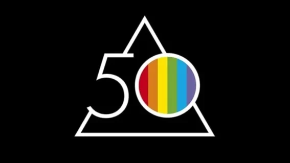
Fifty years ago, Long-time fans of Pink Floyd surely know that the original Dark Side of the Moon of 1973 featured a cover depicting a triangular prism dispersing a white light beam into the colors of the rainbow. Designed by Hipnognosis, a design group that worked with many musicians and bands at that time, that gatefold became as classic as the album itself. But apparently, the new generation of fans is unaware of this fact as the cover logo for the re-edition caused a backlash when presented. Alluding to the 1973 edition, the anniversary logo combines a triangle, the number…