Blog

Alex Ovechkin presents his personal apparel brand created by Nike

Eight years ago, Russian NHL star, playing as the captain of the Washington Capitals, Alex Ovechkin signed a long-term contract with Nike. In the framework of this cooperation that is lasting to present day, the hockey player got a personal logotype designed by the apparel firm. The logo, that can often be noticed on Alex’s jerseys, sticks and skates, represents a kind of a monogram in which one can make out an “O”, a “V” and an “8” referring the uniform number that Ovechkin wears. Continuing the collaboration with the Capitals’ captain, Nike has created a new design for Ovechkin’s…

Glengoyne: Unhurried excellence

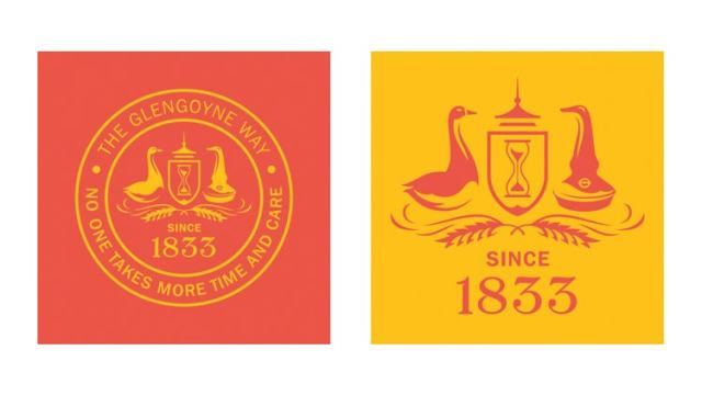
Officially founded in 1833, Glengoyne is a popular Scottish brand producing different malt whiskies with an average age of 25 years. Such a long aging of the whiskies corresponds to one of the principles of the Glengoyne distillery – deliberation – that formed the basis of the company’s new visual identity. The renovated look of Glengoyne was forged by the Bristol-based design agency Taxi Studio. According to the studio’s head Karl Wills, the process of the design revamping can be called a “respectful rejuvenation”, being based on the distillery’s motto “unhurried” as it reflects how the company takes care of…

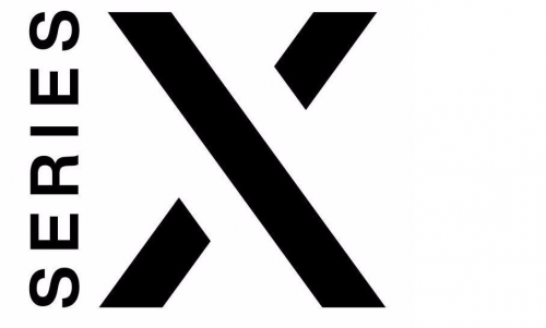
Microsoft’s Xbox Series X logo leaks online

Microsoft is currently developing the The logotype features a vertically-oriented word “Series” along with a big “X”. Having a laconic design, it reminds of some design solutions for the Xbox 360 as well as the Xbox One with a similar splits in the “X”. However, the Xbox Series X’s strokes are thicker and the gaps are larger. While the new logo follows the Xbox’s recognizable style, the slight changes in it tells that the Series X will differ from its predecessor. At the same time, the emblem can give a hint how the logotype for the Xbox Series S should…

American Weed: Legalize It for veterans

With the legalization of medical cannabis in most US states, there are many brands offering cannabis-based products. American Weed Co. is one of them, standing out from others with the fact that it was launched by US Army veterans for retired American soldiers. The founder and head of the company, Sean Gilfillan, is a former high-ranking military officer with a number of battle awards who was among the first troops deployed in Iraq. So you can guess the style of the identity American Weed recently got from Pentagram and designer Mike Tabie. The launch of American Weed Co. needed a…

Infiniti continues to evolve in its logo and branding

The Japanese premium car brand The design embodies the Japanese concept of Ma, a philosophy that is concerned with a space between things. Unlike the Western concept of minimalism, Ma exploits the empty space to maintain a balance between the elements. The rebranding was carried out by the Toronto-based studio Bruce Mau Design. This is the fourth iteration of the Infiniti logo since the brand was launched in 1989. The visual metaphor behind it is the infinite road to the horizon which becomes clearer with the separation of lines. Compared to the previous version, the new emblem is drawn with…

China’s Dalian presents a logo accused of plagiarism

Identity updating is a common step taken by local authorities to attract more visitors to their cities or towns. Following this strategy, the Dalian Culture and Tourism department has recently unveiled a new logo for the city, hoping it will assist in development of the local economy. The refreshing of the visual brand of Dalian, wouldn’t have drawn much attention if the city’s new welcoming emblem weren’t so similar to Disney’s logo. Indeed, if you take a look at the Dalian logo, you can easily see that the “D” and the “i” with a swoop over it are quite identical…

Marc O’Polo unveils its new sustainable look

The fashion brand Marc O’Polo was founded 1967 in Stockholm by Swedes Rolf Lind, Göte Huss and US citizen Jerry O’Sheets. For its apparel collections, the label have always preferred natural materials. Since the transfer of its head office to Stephankirchen, Germany, in 1997, Marc O’Polo began an intensive expansion to international markets. While going to celebrate its 55th anniversary next year, the company has revised its logo, colors, typography and marking. The goal of the rebranding is to make the brand more attractive for the customers. Marc O’Polo’s renovated look was developed by the Munich-based design agency Wiegand von…

Petco removes cat and dog from logo, making consumers outraged

Enjoying a decent sales growth over last two years, Petco has large-scale business plans with a more orientation toward health care for pets. The pet retailer already announced it would expand its chain of veterinarian clinics up to 140 locations by the beginning of 2021, and the process will likely be continued. Aiming to establish itself as a solid pet health care provider, Petco has recently rebranded itself as “Petco, The Health + Wellness Co”, replacing its cat and dog logo with a new one featuring only the company’s new name. However, the brand overhauling faced a harsh criticism. Mews…

More