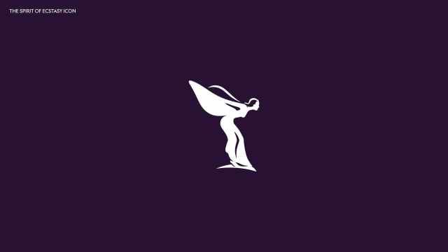
Blog

AS Saint-Etienne offers three logos to vote

Looking for a new investor to strengthen things out, The club’s first variant features the blazon of the city of Saint-Etienne, special typography for the club’s name, and stripes following the curved edges of the logo. The “1933” drawn on a ribbon in the lower part is a distinguishing element of the second version. Highlighting the year when the club turned professional, adopting its current name, the logo puts an accent on ASSE’s history. The green and white straight stripes here are separated from the upper part of the emblem. Finally, logo 3 features a banner with the name of…

Psychology of Design: How It Affects Players’ Behaviour

Design is important in identifying and developing patterns that build products; it helps with problem-solving. The challenge lies within the infinite complex combinations of people and contexts. In game design, players react to the same scenarios in various ways. Therefore, understanding their psychology is vital to engage players with fun experiences. This article will examine the key psychological factors in design and how the psychology of design affects players’ behaviour with examples of how the psychology of design is implemented. Psychological Factors The psychology of design is the various aspects and principles of design that can influence human behaviour. How…

Feeld: Field of love

In the era of social media, dating apps, like Tinder, Badoo, or Match, are changing the nature of relationships by bringing people together in a rather simple way. However, these channels for establishing acquaintances sometimes seem to lag behind the times in terms of gender and sexuality topics. Since 2014, people who seek positive sexual experiences can apply to Feeld to reward their curiosity. Through their geolocation, they can contact other users who share their preferences, among about 20 sexual orientations and gender identities. Initially launched in the United Kingdom, the app is now available in more than 100 countries….

Norton refreshes its logo

Norton, a brand owned by software developer NortonLifeLock Inc., is known for utility applications as well as the Norton Security anti-virus program. Recently, the software brand’s visual identity was refreshed to position it as a “digital ally for customers”, offering a modern and comprehensive design. The Norton products are developed by NortonLifeLock which, in turn, is a part of the software company Symantec. As the company’s press release says, the rebranding marks a new era for Norton. Like people and life, the Norton brand and its products have been developing over the last twenty years. Digital life means just life…

Old War Office turns into luxury hotel with new brand identity

Located in London’s Whitehall, the building known as the Old War Office was used as the headquarter of the UK’s war department from its completion in 1906 to 2014. After the reformed Ministry of Defence had moved to the Main Building, the OWO was sold to Hinduja Group which announced that the building would be converted to a kind of a luxury hotel with residential apartments. Aiming to develop the image of the new hotel, the owners hired design agency Greenspace that created a branding involving the OWO’s history as well as graphic motifs from the early 1900’s. Despite today’s…

Marc O’Polo unveils its new sustainable look

The fashion brand Marc O’Polo was founded 1967 in Stockholm by Swedes Rolf Lind, Göte Huss and US citizen Jerry O’Sheets. For its apparel collections, the label have always preferred natural materials. Since the transfer of its head office to Stephankirchen, Germany, in 1997, Marc O’Polo began an intensive expansion to international markets. While going to celebrate its 55th anniversary next year, the company has revised its logo, colors, typography and marking. The goal of the rebranding is to make the brand more attractive for the customers. Marc O’Polo’s renovated look was developed by the Munich-based design agency Wiegand von…

Black Star Pastry: Between innocence and elegance

The Australian brand Black Star Pastry is a good example of how a local pastry becomes a worldwide food icon. Amid a craze for its cakes, which New York Times called “the world’s most instagramable”, the company felt the need to adjust its strategy to its rapid growth. Such swift changes are not uncommon in today’s social media era, but a business has to build its brand strategy thoroughly in order not to be trapped by immediate success. So, approaching the issue seriously, the Australian bakery applied to the Melbourne-based Ongarato Studio and Japanese illustrator Noritake to create a “graphic…

England’s Football Association presents England Football brand

The world’s oldest European football organization, the Football Association of England has launched a new brand reflecting its aspiration to unify all levels of the sport – from the managing bodies to the ordinary players. Named England Football, the new brand was visually designed by Matta, a design studio from London. Inspired by the Royal arms of England and the FA crest, the England Football logo depicts a lion, lioness and cub. According to Louis Swann, Matta’s creative director, this has to symbolize men’s teams, women’s teams and youth teams. The emblem’s red color, which is described as “striking red”,…

More