Blog

BMW introduces new logo, first update in 23 years

As this year’s Geneva Auto Show has been canceled due to the threat of the coronavirus epidemic, some automakers have to content themselves with their own more modest events while presenting their new cars. So, BMW has unveiled its new i4 concept with an electric engine at a simple press conference. Apart from the sleek exterior and powerful eco-friendly motor, this electrocar has been distinguished with a new BMW logo. Compared to the classic As BMW’s chief management officer Jens Thiemer said, the company is striving for closer relationship with customers, and its new emblem is intended to convey clarity…

New logo for 2020 NHL Stadium Series is unveiled

On the 10th of October the logo for the upcoming Stadium Series was revealed by the NHL. The first game of the season is scheduled on the 15th of February 2020. This time the Colorado Avalanche, the host of the competition, will face off with the Los Angeles Kings at the Falcon Stadium. As the central element of the 2020 Stadium Series logo it’s chosen an image of the Cadet Chapel, located on the Air Force Academy campus. In the upper right corner there’s pictured a jet, flying over the Chapel, one more indication on the host of the forthcoming significant…

Eredivisie’s Willem II updates its logo

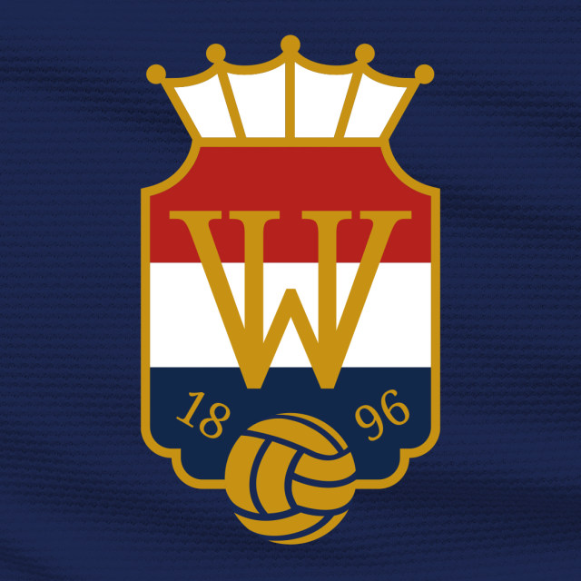
Playing in the Netherlands’ football top division Eredivisie, the Willem II is approaching to its 125th anniversary the club will celebrate next season. On this occasion, the team has updated its logo. The new emblem, which is the sixth iteration in the club’s history, was created, considering the traditional symbolism of Willem II as well as the long-time wishes of fans to return to the logo basics used from 1952 to 1983. The traditional colors of the team from Tilburg have always been red, white and blue, accordingly to the Netherlands’ national flag. Based on this fact and the design…

Rolls-Royce introduces new brand identity

Today, For advertising materials and other Rolls-Royce products, a simpler version of the Spirit of Ecstasy has been designed. She will be depicted facing towards the right – according to the designers, this has to symbolize the company’s committing to the future. As Marina Willer, the head of the designing team, said, the Spirit of Ecstasy is an excellent image for a modern brand, and her use in terms of branding will bring new vibes into Rolls-Royce’s identity. The stretching posture of the flying lady corresponds with the company’s aspiration to the superior quality in its luxury products. Now, the…

Sixt makes small changes to its logo

Founded in 1912, Sixt’s rebranding is connected with the company’s new international campaign entitled “Rent E-mobility!” which will feature the brand’s modernized look including a logo designed in a different typeface. Although Sixt’s new logo retains the general structure of the previous version, you can immediately notice the difference including an altered color scheme, a new form of the “S”, and a bit extended curved stroke over the “i”. The brand still upholds its customary colors: black, orange, and white. However, the Sixt emblem now showcases a deeper shade of orange (#ff5f00), which is closer to red. Apparently, the color…

Black Star Pastry: Between innocence and elegance

The Australian brand Black Star Pastry is a good example of how a local pastry becomes a worldwide food icon. Amid a craze for its cakes, which New York Times called “the world’s most instagramable”, the company felt the need to adjust its strategy to its rapid growth. Such swift changes are not uncommon in today’s social media era, but a business has to build its brand strategy thoroughly in order not to be trapped by immediate success. So, approaching the issue seriously, the Australian bakery applied to the Melbourne-based Ongarato Studio and Japanese illustrator Noritake to create a “graphic…

Wolff Olins repositions grocery brand Instacart

Founded in 2012 by Amazon’s former supply chain engineer Apoorva Mehta, Instacart is a grocery delivery company that operates in the United States and Canada. As the coronavirus pandemic with the lockdown and increased demand for food delivery urged it to reorganize itself, the company felt the need to bring some refreshments into its visual identity as well. This task was commissioned to the international design studio Wolff Olins. For Instacart, the studio created an encompassing branding system called “Shop+Savor ethos” – this name, according to Wolff Olins, has to express the idea of how the service powers customers’ shopping…

Real Betis updates its visual identity

By winning this year’s Copa del Rey, According to the club, the rebranding, carried out by the international design agency Accenture, “follows the line of continuity” rather than aims to adapt to digital environments, avoiding radical changes for the basic elements. However, some improvements have still been brought, including an adjusted color palette and a new custom typeface. First of all, Betis’ crest was redesigned to have simpler elements. Thus, the crown got rid of smaller details which were, according to Accenture, visual noise. The double B was revised as well. The vignette, standing for “Betis Balompié” (the latter word…

More