Category: News

共有 416
Argentina’s payment service rolls out a new visual identity

Changing its visual identity, the Argentinian fintech company Ualá has unveiled a new logo demonstrating a remarkable refinement in design that may be considered a good example of a modern rebranding. The visual refreshment is part of an encompassing repositioning that aims to make a leap, expanding in the region with over 25 million clients during the next five years. Launched by Argentinian entrepreneur Pierpaolo Barbieri in 2017, Ualá offers a mobile app for managing The base element which was highlighted in the redesign is the Ualá symbol. Reminding the infinity sign, it is intended to reflect the diversity of…

Minute Maid unifies its visual identity as a global brand

The premium soft drink brand Since the brand was founded in 1945, the Minute Maid logo has gone through only five iterations. The goal of the current overhaul was to unify the design, giving the brand a common identity in more than 100 countries where it is present today. Different product names are planned to be unified as well, depending on the market. The Minute Maid logo has kept its general design, with a black background, dropping, however, the green top. Thus, the emblem looks flatter, featuring a more rounded typeface in the spirit of the original design of 1945….

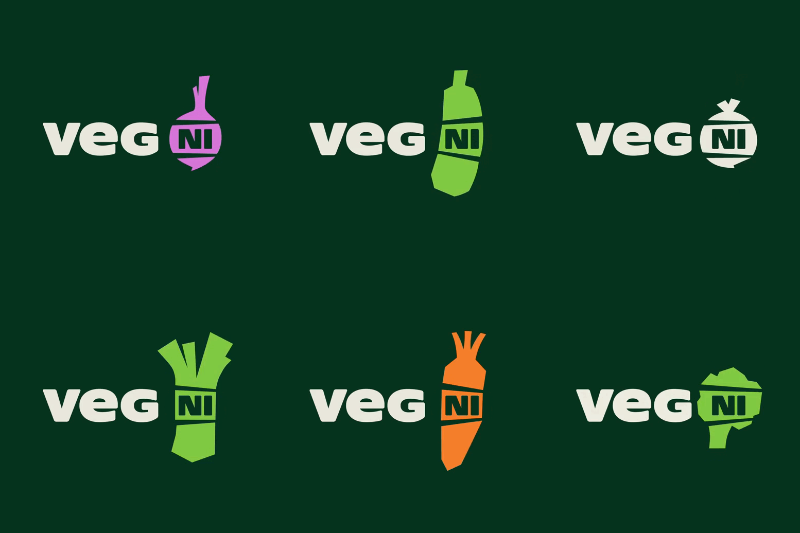
Veg NI: A brand for local veg

Veg NI is an agricultural cooperative in Northern Ireland founded by four farmers to better market their products amid growing import competition. Recently, the company has updated its visual identity, aiming to strengthen its position and increase the awareness of local vegetables. Veg NI’s new image was developed by Jack Renwick, a design studio from London. Based on a concept called Parful Produce, the branding has to covey the positive effect of Northern Irish food products on people’s health and economy. Seasonal vegs here are indeed fresh and nutritious. Plus, this is a more sustainable way of consumption, compared to…

Bershka updates its logo, following its sister brands

Launched in 1998, If somebody expected it to be a kind of a wow factor, forget it. The new Bershka logo’s design still resembles those of the related brands. The wordmark is bolder now, showcasing more geometric and integrated typography. The redesign was carried out by Bershka’s in-house design team in cooperation with a Berlin-based studio that specializes in typography branding and works with the Dinamo Typefaces agency which has some experience in fashion branding. The graphic line of the project reminds us of the latest changes in the look of Inditex, Bershka’s parent body, which underwent a redesign last…

Cohere: Nature and digitality

Today, we observe exponential growth in AI technology. The promises from the super-trained algorithms are as amazing as frightful. Over the past few weeks, ChatGPT, a neuronal network developed by OpenAI, has been in the spotlight due to its ability to create texts and chat like a real person. However, when it comes to the practical application of artificial intelligence, the technology can be used, for example, in linguistics to automatize research processes dealing with a large amount of data. And it’s the challenge that is going to be met by Cohere, a Canadian company providing natural language processing (NLP)…

LG’s face logo gets animated, showing off different expressions

The face/smile design is quite popular in branding. Amazon, Elevating the South Korean company to a next level, the new visual identity of LG Electronics is designed to be suited for both physical and digital carriers. According to a press release, the rebranding’s goal is to put LG closer to the new generation and confirm it as an iconic brand. The company also aims “to rethink its visual strategy to tell its values to all customers regardless of their location on the planet”. The most surprising thing in the visual identity is the animated version of the LG logo for…

San Francisco: Make your place in the future

The Covid-19 pandemic caused an upheaval in the business world. Due to a range of lockdowns, many companies had no other choice but to switch to distance working. Employees in metropolises across the world combined this freedom to work in any place with carving for nature. As a result, a lot of people relocated to suburbs and small towns. In the US, this phenomenon appeared to be especially noticeable in San Francisco, where, after three years after the healthcare crisis, the recovery rate still stays one of the lowest in the country. In this connection, the City of San Francisco,…

No orange, no leaf. The logo of Fanta is simply blue

Following Pepsi, another soft drink brand has changed its logo. The famous In fact, Coca-Cola, the brand’s owner, is trying to build a synchronous and global identity on a new stage of its journey. Within this purpose, Fanta’s look was remastered by Jones Knowles Ritchie, a design agency known for its work with big food & drink brands. The rebranding resulted in a logo distinguished by cornered typography, keeping only blue and white as brand colors. Besides the orange, the Fanta logo has also ditched the green leaf. These two elements have been customary features of the emblem since 2008….

More