Category: News

共有 416
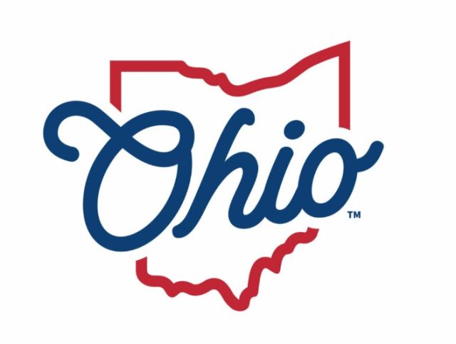
Ohio has returned to its old tourism slogan, refreshing its brand identity

The State of Ohio has updated its tourism brand, bringing back a slogan that was used back in the 1980s-1990s. The announcement took place this Wednesday when the state was celebrating Tourism Day. The new visual identity is hoped to attract new visitors and businesses. Located in the US Midwest, Ohio is the seventh-most populous state, with a population of 11.8. In the state’s new brand identity, the new old tagline “Ohio, The Heart of It All” is as important as the logo which conveys a retro-feeling of the 1950s through the typography. It replaces the slogan “Find it here”…

2026 FIFA World Cup identity introduces new design system

Last week, The 2026 FIFA World Cup in North America will be the first global football event with 48 national teams. In total, they will play 104 matches at 16 stadiums (12 – in the US, 2 – in Canada, 2 – in Mexico). As CONCACAF President Victor Montagliani said at the presentation, the upcoming World Cup is going to be the greatest, most inclusive, and most diverse. Presenting the logo, FIFA wants it to be considered as a symbol of football and diversity. According to the association, the basic visual concept, combining a depiction of the trophy and a…

Sixt makes small changes to its logo

Founded in 1912, Sixt’s rebranding is connected with the company’s new international campaign entitled “Rent E-mobility!” which will feature the brand’s modernized look including a logo designed in a different typeface. Although Sixt’s new logo retains the general structure of the previous version, you can immediately notice the difference including an altered color scheme, a new form of the “S”, and a bit extended curved stroke over the “i”. The brand still upholds its customary colors: black, orange, and white. However, the Sixt emblem now showcases a deeper shade of orange (#ff5f00), which is closer to red. Apparently, the color…

Opel’s iconic Blitz is changed again

German car brand According to a statement from the company, the recently presented Blitz is intended to symbolize the era of e-mobility in Opel’s journey. Indeed, we observe a new stage in the 121-year history of the car manufacturer, lately. Five years ago, the company was acquired by PSA-Group from General Motors to become a part of the Stellantis corporation. After a year of financial austerity, it showed profitable results again. Like other car brands of Stellantis, including Citroën, Peugeot, Fiat, and Jeep, the German marque is transitioning to electric technology for its products. By the end of this year,…

The Grande Arche: A branding for renovation

Erected in 1989 to mark the bicentennial of the French Revolution, La Grande Arche de la Défense takes its rightful place among the attractions of Paris. The cube-shaped construction excites with its size of more than 350 ft in height, width, and depth. As conceived by Danish architect Johan Otto von Spreckelsen who won a special competition, it should symbolize a window to the world. In fact, the building houses government offices in its two sides and an observation deck on the top. The Arche is currently undergoing a large-scale renovation, with plans to accommodate here private businesses and companies….

New logo of Spezia Calcio makes scandal, resembling a Nazi symbol

Slipping from   Indeed, the presented logo features a specific form of an eagle’s head and wings overhanging stylized letters “S” and “C”, which cannot help associating with fascist iconography. “The new logo of Spezia seems, so to say, too Nazi”, a Twitter user noticed. Nevertheless, the Ligurian club stated that “the logo was developed for all fans to take pride in”. However, the reaction from fans was not laudatory, according to Italian news agency Ansa. “Awful”, “looks like a Nazi symbol”, and “It’s an insult to our city’s history” are some of those critical comments that immediately appeared on…

American Weed: Legalize It for veterans

With the legalization of medical cannabis in most US states, there are many brands offering cannabis-based products. American Weed Co. is one of them, standing out from others with the fact that it was launched by US Army veterans for retired American soldiers. The founder and head of the company, Sean Gilfillan, is a former high-ranking military officer with a number of battle awards who was among the first troops deployed in Iraq. So you can guess the style of the identity American Weed recently got from Pentagram and designer Mike Tabie. The launch of American Weed Co. needed a…

Infiniti continues to evolve in its logo and branding

The Japanese premium car brand The design embodies the Japanese concept of Ma, a philosophy that is concerned with a space between things. Unlike the Western concept of minimalism, Ma exploits the empty space to maintain a balance between the elements. The rebranding was carried out by the Toronto-based studio Bruce Mau Design. This is the fourth iteration of the Infiniti logo since the brand was launched in 1989. The visual metaphor behind it is the infinite road to the horizon which becomes clearer with the separation of lines. Compared to the previous version, the new emblem is drawn with…

More