Category: News

共有 416
Tirlán: The land of abundance

Launched in 2017 as a joint venture, Glanbia Ireland has been known as a dairy and agriculture ingredients brand backed by a co-operative of Irish farmers. Gaining independence from Glanbia, a global nutrition group, the co-op has rebranded as Tirlán, unveiling a new brand identity rooted in its Irish heritage. The co-op’s branding was completely created by the prominent design agency Siegel+Gate that started from naming. Figuring out that the company needed a original and self-standing identity, the developing group proposed the name Tirlán as a combination of Irish words “Tir” meaning land and “Lán” for full. So, it can…

Roblox adjusts its logo, trying to build its own metaverse

Launched in 2006, Actually, the Roblox emblem didn’t change much, representing a fresh vision of the iconic Roblox wordmark, according to the company. The aperture in the first square-like “O” has become bigger, while the second square-formed “O” has been replaced with a round one. As Roblox CEO David Baszucki said, the updated emblem showcases custom letterforms that are perceived as lighter, reflecting a more modern aesthetics. Having a classic form now, the second “O” makes a contrast with the first “O” whose slope was adjusted, saving the distinct character of the logo. While the platform’s logo has received minimal…

Formula E gets a new visual identity

Launched in 2014, Formula E is a motorsport championship for electric cars. Early this year, the competition announced that it would introduce new Gen3 cars for the 2022/23 season. These vehicles are expected to have a capacity of 350 kW (470 hp). The technical update will be accompanied by some other renovations like recharging pit stops and new tires from The Formula E new look is based on the “torque loop” representing the “excitement and energy” of the championship. The loop motif also supports new typography and the design for the news section of the brand. Formula E has kept…

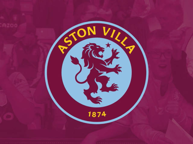
Aston Villa unveils a new logo chosen by fans

This summer, Aston Villa is currently owned by NSWE Group, a venture company of Egyptian billionaire Nassef Sawiris and American tycoon Wes Edens. Early this month, the club welcomed Unai Emery as its new head coach. So it is aiming at achieving new heights in England’s Premiere League, and that has to be confirmed by the AV redesigned look. Essentially, Aston Villa’s rebranding is based on a survey from the club’s members and holders of season tickets. It gave some ideas for two design lines, developed by a professional designing team in cooperation with the so-called Fan Consultation Group, which…

Audi cars will soon receive a two-color logo

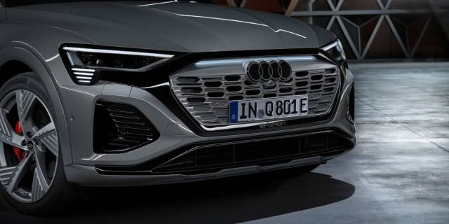
The Back in 2020, the German car maker introduced a new corporate identity. Now, the Ingolstadt-based brand is adjusting its trademark to its new-gen vehicles, designing the four rings logo in a stricter style. While the Audi 3D chromed car logo will soon become history, the brand is transiting to a flat emblem. The rings are now executed in white, and each of them is framed in a thin black bordering. Additionally, a black version will be provided, with the inner edges of the rings colored in dark gray. In general, this logo has to have a stylish glossy look….

Glenmorangie: A new design for a whiskey brand

Established in 1843, Glenmorangie is a Having a long history, the Glenmorangie distillery is a subsidiary of the French group Moet Hennessy Louis Vuitton since 2004. In recent years, the company has increased its appeal in the overseas luxury goods market, offering new brand whiskies like Nectar d’Or, The Quinta Ruban, and LaSanta. As for the redesign, the brand’s look was comprehensively revised. Apart from the general visual elements, it affected the packaging for Glenmorangie’s major products including the forms of bottles and labels. According to the distillery’s Global Head of Brand Louise Dennett, the remastered packaging conveys the taste…

The Bronx Museum presents a new visual identity

Founded in 1971, the Bronx Museum of the Arts is a unique artistic space dedicated to contemporary art. Exhibiting a collection of more than 2,000 works, the museum calls its mission “connecting diverse audiences to the urban experience through special exhibitions and education programs. Aspiring to clearly articulate the ideas of capturing the modern culture as well as the spirit and tenacity of The Bronx, BxMA has unveiled a new visual identity created by the New York-based design studio Team. The Bronx itself gave inspiration for the museum’s updated look as this is NY’s only borough with “The” in its…

Rafa Nadal: Game. Set. Brand

Having 22 Grand Slams on his account, Rafael Nadal is the most titled tennis player in history. In 2016, he launched a tennis academy under his own name, supported by Spanish telecommunications provider Movistar. The academy teaches young people to play tennis in the spirit of Nadal’s path to success. Now, Rafa himself and his institution with other related activities seem to become a real brand, maybe, following the way of René A good sign of Nadal’s brand-oriented direction is the new visual identity of the Rafa Nadal Academy, celebrating six years of its existence. Although the general design of…

More