Category: News

共有 416
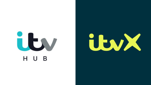
ITV unveils new visual identity, relaunching its streaming service

One of the leading TV networks in the UK, ITV was launched in 1955, with the idea to break the monopoly of BBC at that time. Over four decades after that, the network had been operating separate TV companies which shared common programs and series, having, however, each its franchise. Now, after several mergers and acquisitions, these fifteen regional franchises are owned by two networks: STV which broadcasts in Scotland, and ITV for the rest of the UK. The journey of the network has been full of TV hits, like The Saint, Mr. Bean, and Downton Abbey. ITV has also…

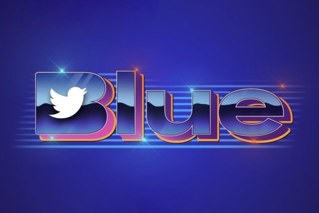
Musk’s Twitter presents a “perfectly awful” logo for its subscription service

After acquiring Described as a “disaster” and a “perfectly awful branding” on the web, the emblem resembles a 1980s-style design as if it was taken from the Strange Things series. Given the mass layoffs that have been in Twitter in the last two months, this logo may have been created by an external design group. Or perhaps, it was compiled by a neural network like Midjourney or DALL-E 2 that are talked about so much lately. Maybe, we’ll never know who forged Twitter Blue’s logo, but anyway, it would be foolish to think that it was carried out by Musk…

NBC updates its peacock logo

The The peacock’s current image as we know it today appeared in 1986, designed by the Chermayeff & Geismar studio. That rebranding also brought the NBC lettering executed in a corporate typeface based on the Futura font family. While the new version retains traditional coloring, its distinction lies in a bit different design of the peacock and a new font for the “NBC”. The previous facelift of the NBC logo was in 2013. The network, like many other companies at that time, aimed to maintain communications via a brand identity with such visual effects as glossiness, shadowing, and pseudodimensionality. However,…

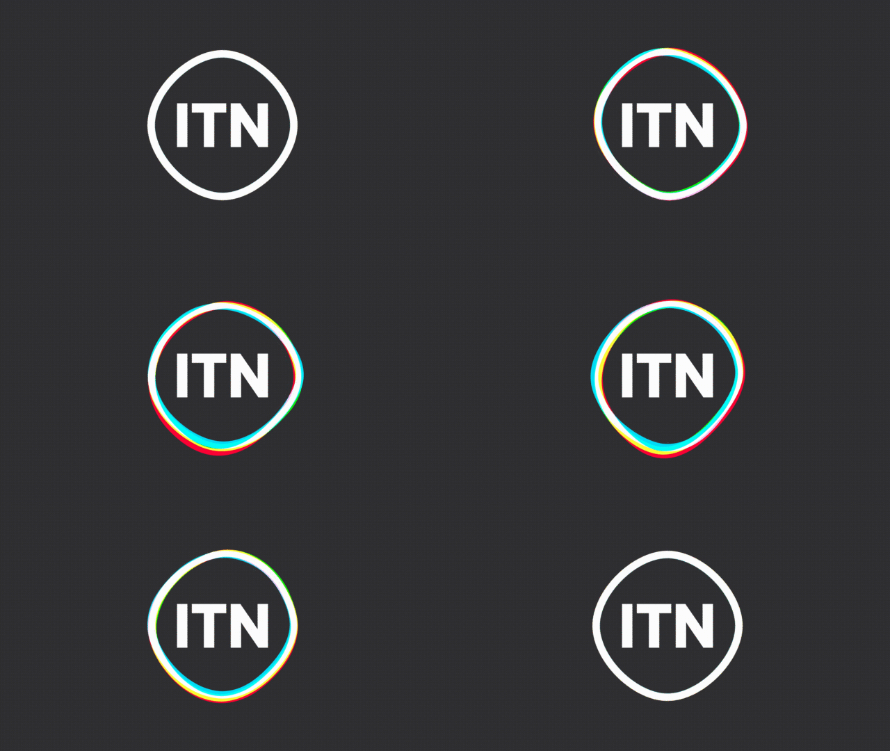
UK’s TV news company carries out the first rebranding since 1970

Founded in 1955, Independent Television News is a British television production company that operates three news channels, including ITN’s new look was developed by London-based Rudd Studio and Undivided design agency. Working on the company’s visual identity, the joint designing team was keeping in mind ITN’s reputation as an independent and accurate news agency that pioneered much of the world of news. Based on research among the company’s staff and customers, a new brand positioning was created, under the slogan “Truth to Life” which reflects ITN’s shift to more diverse content including factual, entertainment, and corporate production. Feeling that the…

Netflix: New look, same logo

Why touch the logo of an iconic brand like Netflix? Is it necessary? Actually, no. The goal of the Netflix project was to create a proper language. According to Koto, the streaming service wanted this language to be implemented into its experience with production and beyond. Starting from this point, the studio upgraded the previous design system with brand-new iconography, typography, and imagery. Koto departed from the unidimensional and oversaturated approach to the graphic language which is so typical for the technology and streaming world. This resulted in “a style appealing to movie lovers and essentially feels like Netflix”. And…

Nokia updates its logo for the first time in 45 years

The announced redesign is the most dramatic renovation in Nokia’s history. The brand’s logo representing an all-caps wordmark has been used unchanged since 1978. As the MWC 2023, held in Barcelona, is the first event’s edition after the coronavirus break, the company has chosen it to present its new face. Backed by the new corporate strategy, the brand identity has to reflect what the Nokia brand is now – “a B2B technology leader pioneering the future where networks meet cloud”. Expressing the present day’s image of Nokia, as the company’s press release says, the visual identity also conveys the renewed…

Pentagram refreshes the visual identity of Amazon’s streaming service

Prime Video, Amazon’s streaming service, has launched a completely new visual identity by Emily Oberman and her Pentagram team. The rebranding, however, is not a big surprise as it is a result of a process which had been carried out since August 2022. Last year, Pentagram’s solution came from Amazon’s iconic smile-arrow and through the “dimple” sign. The formal distinction of the curved line thus becomes a “catalyst guiding the audience through the endless wave of their favorite content”, the Pentagram team explains. But the project goes beyond. This idea was embodied in the wave as one of the basic…

Brazil restores its iconic country brand under Lula’s presidency

The Brazil brand comes back to the iconic design of 2005. The relaunch includes a campaign to reposition the brand and announce some plans in the new political cycle. Its main goal is to present Brazil as a multinational and multicultural country made up of different forms, ecosystems, rhythms, and colors. A country with clear prospects, which aspires to confirm its commitment to stable development. In this new stage, the Brazil brand is abandoning “nationalism” in terms of visual identity, which has been over the last four years under the rule of Jair Bolsonaro – a fact that may become…

More