Category: News

共有 416
Pentagram remasters Channel 4 brand

Established in 1982 to create a cultural alternative to BBC and ITV, According to Luke Powell, Pentagram’s creative director, Channel 4 had conducted research, defining what and why should be changed in its image to visually correspond with technological innovations, before it applied to the studio. One of the most important things for the broadcaster was to improve the recognizability of the Channel 4 content no matter on what platform people are watching it. Another priority of the channel for the rebranding was to “maintain the creative spirit inherent to Channel 4”. As 4creative’s head Lynsey Atkin explains, the agitational…

Hispano-Suiza: Reviving a luxury brand

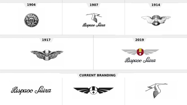
For many in Spain, Hispano-Suiza had long been another word for a luxury car. Founded in 1904, the firm is one of the oldest car brands in the Iberian Peninsula and became famous for its high-quality vehicles with their chic, safety, and fuel economy, as well as its numerous wins in racing competitions. However, the brand disappeared after WWII, and it needed a really new approach to be revived. What is Hispano-Suiza doing now to be relevant in the totally changed industry, staying true, at the same time, to its historic heritage? The main task of FutureBrand, which developed Hispano-Suiza’s…

Ohio has returned to its old tourism slogan, refreshing its brand identity

The State of Ohio has updated its tourism brand, bringing back a slogan that was used back in the 1980s-1990s. The announcement took place this Wednesday when the state was celebrating Tourism Day. The new visual identity is hoped to attract new visitors and businesses. Located in the US Midwest, Ohio is the seventh-most populous state, with a population of 11.8. In the state’s new brand identity, the new old tagline “Ohio, The Heart of It All” is as important as the logo which conveys a retro-feeling of the 1950s through the typography. It replaces the slogan “Find it here”…

2026 FIFA World Cup identity introduces new design system

Last week, The 2026 FIFA World Cup in North America will be the first global football event with 48 national teams. In total, they will play 104 matches at 16 stadiums (12 – in the US, 2 – in Canada, 2 – in Mexico). As CONCACAF President Victor Montagliani said at the presentation, the upcoming World Cup is going to be the greatest, most inclusive, and most diverse. Presenting the logo, FIFA wants it to be considered as a symbol of football and diversity. According to the association, the basic visual concept, combining a depiction of the trophy and a…

Sixt makes small changes to its logo

Founded in 1912, Sixt’s rebranding is connected with the company’s new international campaign entitled “Rent E-mobility!” which will feature the brand’s modernized look including a logo designed in a different typeface. Although Sixt’s new logo retains the general structure of the previous version, you can immediately notice the difference including an altered color scheme, a new form of the “S”, and a bit extended curved stroke over the “i”. The brand still upholds its customary colors: black, orange, and white. However, the Sixt emblem now showcases a deeper shade of orange (#ff5f00), which is closer to red. Apparently, the color…

Insurance company Aegon adopts new emblem

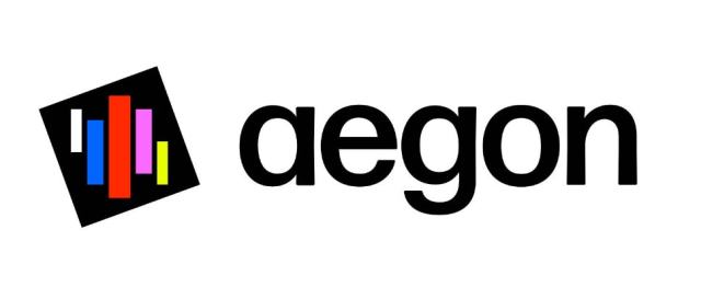
Founded in 1983, Celebrating its 40th anniversary this year, Aegon now presents itself under a new logo which was unveiled at Capital Markets Day 2023, along with the future strategy of the company. According to an official statement, the new visual identity marks the next chapter in Aegon’s transformation as the company is adapting its structure to new market conditions. Its divisions are said to focus more on achieving their strategic objectives of improving the quality of services and offerings and maintaining strict control. To emphasize these changes and better reflect the profile of the business, Aegon will appear with…

Havas: A consistent logo for a corporate culture

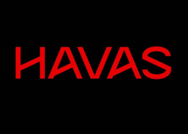
Established in 1835, Havas can be considered the oldest news agency in the world. Evolved into a multinational enterprise, the French company now specializes more in public relations and advertising technology. Havas operates in more than 100 countries, with a staff of 22,000. The brand has recently refreshed its logo to show what Havas is today. Fulfilled in cooperation with the international agency Conran Design Group, the redesign is the first update of Havas’ visual identity in 20 years. According to the company, the new look is intended to tell that Havas is “a creative and integrated power pack that…

Coworking brand WeWork rolls out new logo

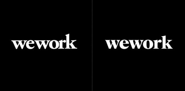
The redesign has been carried out by the New York-based design studio Franklyn and aims to redefine and expand the assets of WeWork, which could co-exist with the pre-existing things, not changing the image of the company. While WeWork’s previous branding by GretelNY partly included a colored design for the logo and other visual elements, the new look features a black-and-white version of the logo only. This formal solution, according to the company, seeks to make the brand more consistent in different contexts, whether in digital apps or physical signboards. The project is also concerned with improving and stylizing the…

More