Blog

Zoom updates its visual identity, positioning itself as a brand

As Zoom decided an update its visual identity, it faced a couple of issues. First, Zoom is not positioned as a brand but as a service in the video calling segment. In addition, end-users really think so. However, the platform argues that video conferencing is only a part of a wide range of its services. Accordingly, the company is seeking to position the platform as a versatile tool for facilitating cooperation and team working. Zoom has therefore presented an original version of its logo with six “O”’s. Actually, the main version of the emblem still has two “O”’s, renovated with…

The Colour Green: A Winning Choice for Brands and Logos

Green isn’t just a colour; it’s more. It stands for nature, growth, and wealth. In the world of brands and logos, green plays a big role. It shows everything from caring about the environment to making money. It reminds us of peaceful landscapes and does things to our minds. Companies use green when they want to show what they stand for. Green in Branding: What Does it Mean? Think about green logos. Brands like Tropicana come to mind. They make tasty fruit juices. The green in their logo isn’t just because. It’s done on purpose. It shows they care about…

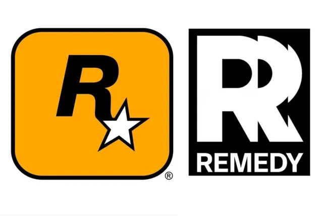
Rockstar Games is fighting Remedy Entertainment over its new ‘R’ logo

Rockstar Games, owned by Take-Two Interactive, has initiated a legal suit against the Finnish game developer Remedy Entertainment over its logo featuring an R symbol. This case is especially curious, as both companies have been partners for many years, collaborating on the Max Payne franchise. Just last year, the Finnish company introduced its new logo after more than 20 years. Instead of the encircled “R” the brand had before, the emblem showcases a vibrant “R”, while an alternate version may also include the lettering “Remedy”. In Rockstar and Take-Two, as parent entity, they think, however, that this design is too…

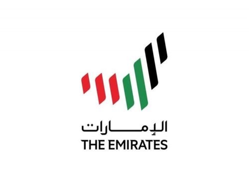
United Arab Emirates realease new country brand

After a month-long online voting, the leaders of the United Arab Emirates have presented the winning logo that will be representing the country to the world. The official presentation, that took place at the Presidential palace Qasr al Watan in Abu Dhabi, was led by Vice President Sheikh Mohammed Bin Rashid Al Maktoum and Crown Prince of Abu Dhabi Sheikh Mohammed Bin Zayed Al Nahyan. The logo represents a symbolic map of the UAE formed with seven stripes in the colors of the country’s national flag that, in turn, symbolyze the seven Emirates. The stripes also pay tribute to the…

Condor: Striped vacation

Established in 1955, Condor is a German airline offering flights to the Mediterranean Basin, Asia, Africa, North and South America as well as the Caribbean islands. Recently, the company has received a new brand identity distinguished by a bright striped design. Condor’s airplanes will be repainted with colorful stripes “for a good mood”. As the airline explains in a press release, Condor has undergone some changes over the last two years as it evolved from a subsidiary of a vertically-integrated tourism group to an independent airline “which is proudly looking back at its history and tradition, and, at the same…

Zapier: Orange storytelling

Launched in 2012, Zapier is a product that allows end-users to integrate the web application they use and automate workflows. In other words, it serves as a kind of translator between different application programming interfaces and helps improve worker productivity as it saves time, automating recurring tasks. To celebrate its 10th anniversary, the IT brand has updated its visual identity, which better expresses the functionality and utility of the technology. Although Zapier’s rebranding is not flashy and not too exciting, as the company’s creative director Michael Jeter says, the new design “serves as a base for the whole business and…

CW overhauls its visual identity with new programming strategy

The CW Television Network is currently undergoing a complete image revision to coincide with the company’s 18th anniversary and transition to new ownership. With this step, the CW aims to alter its audience strategy and improve its position among American broadcasters. Compared to other TV companies such as NBC, ABC, or FOX, which emerged in the 20th century, the CW has a relatively short history. The broadcaster was launched in 2006 after the merger of The WB (Warner Bros.) and UPN (CBS). Through this deal, the entertainment giants intended to create a network that could compete with larger stations by…

NWHL welcomes Toronto Six

On April 22nd, the National Women’s Hockey League announced that an extension team from Canada would start playing in the 2020-21 season. Almost one month later, it has been officially presented as the Toronto Six. Besides the name, the team has unveiled its colors and logo. To choose the name for the team, an online vote was organized. Fans suggested such names as the Lady Leafs, Lakers, Polar Bears, Furies and others. However, the vote was won by “Toronto Six”. Apart from referring to the number of players on ice, it also may have connection with six cities which formed…

More