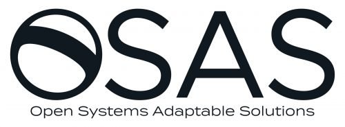
Blog

B for balance. A multi-meaning logo for French recruiting firm

In the ever-evolving world of professionals, it is crucial to illustrate how individual satisfaction and collective success are interconnected. This concept underpins Bloch Consulting’s new identity, an executive search firm specializing in lifestyle and sports based in Paris, France. The global transformation, led by design agency Be Dandy, signifies a pivotal moment in the company’s organic growth towards international markets. By implementing contemporary methods, Bloch Consulting is dedicated to meeting applicant expectations while aligning with company objectives. Maintaining this equilibrium, the firm firmly believes that the professional skills of its candidates are pivotal for employers’ advancement. Hence, the brand values…

Soccer and the City
Soccer and the City

As the Major League Soccer announced its plan to expand to 30 teams last year, St. Louis has been preparing to launch its own expansion team. Initially, it was planned that a team from St. Louis would join MLS in 2022, but due to the coronavirus pandemic and the delay in the construction of the St. Louis soccer stadium, it may start playing in the league only in 2023. Waiting for the franchise’s debut in MLS, the ownership group has unveiled the club’s name and logo. St. Louis City SC, the name for the team, was chosen in a vote…

National Instruments rebrand as NI, rolling out new logo

Maybe, not so many people heard about National Instruments, but, every day, we meet such names as 3G, 4G LTE, and 5G. All of these mobile technologies were created with use of the means developed by NI. Incidentally, the abbreviation “NI” became widely used among the engineering society and turned into a kind of a brand. That’s why the company made a decision to officially rebrand itself as NI. It is worth to mention that the rebranding was preceded by a wide-scale reorganization of the company. National Instruments were divided into several units, and new divisions for machine learning, data…

British Equestrian Federation changes its name and logo

Founded in 1972, the British Equestrian Federation is the national organization for equestrian sport in United Kingdom. Recently, BEF has carried out a rebranding by renaming itself to British Equestrian and rolling out a new logo. According to British Equestrian’s officials, while changing its name, the organization follows the trend among many sports governing bodies that drop such words as Federation, Union or Association from their names as this fits more the spirit of the present time. Under its auspices, the new brand will unify Equestrian Team GBR that brings together UK’s professional horse riders, and Hoof, a body advocating…

Nisus unveils its new identity

Established in 1990, Nisus Corporation is a company that has built a reliable reputation in producing wood preservatives. Having entered the market as a simple start-up with Bora-Care, an advanced product which proved to be very efficient in pest control, it has eventually evolved into a solid enterprise offering innovative chemicals with low environmental impact. Celebrating its 30th anniversary this year, Nisus has recently adopted a new logo including a tagline and also introduced a brand-new website. With Nisus’ latest achievements in business and technology, the management of the company realized that the old logo introduced 15 years ago doesn’t…

City of Hays gets a new logo

The City of Hays, Kansas, has acquired a new logo. The emblem was presented on November 8th by the city’s mayor Toby Dougherty and the officials of the City Convention and Visitors Bureau. The new logo features a stylized yellow letter “h” accompanied by the wordmark “City of Hays”. It was created by Scott Gross, a local design specialist. In his work, Gross took into account the opinions of the city authorities and community members who gave him a hint that the logo should share a common trait with a sign of the Interstate 70 highway that goes through Hays,…

M&M’s revamps its visual identity for an inclusive future

Having a more than 80-year history, the chocolate brand M&M’s is launching a new rebranding, announcing a strategy oriented towards public communications, inclusiveness and diversity. To emphasize these values, the new identity focuses on the brand’s recognizable ampersand. M&M’s new look was created by Jones Knowles Ritchie, a prominent design agency known for its works with big food brands like Burger King and Baskin-Robbins’. Including a lot of details, the project deals not only with visual branding but also a verbal image and the storytelling about M&M’s individuality. Fulfilling its mission, JKR developed a flexible visual identity that allows the…

Citroën introduces new logo

It seems that time has come for The brand’s slogan “Citroën, inspired by you” has also been removed. Spots are added to Citroën’s francophone Twitter that features a monochrome animated version of the chevrons. Citroën hasn’t published an official press release on the redesign yet. And it is certainly worth to be reported as it concerns not only the trademark, but also the wordmark. . The trademark introduced in 2016 and the wordmark that has been used since 2009 are giving way to a flat “double corner” sign as well as an all-caps lettering in the corporate typeface Citroen. The…

More