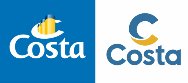
The Italian cruise line According to Costa Crociere, it has updated all its offerings, emphasizing the “steadfast exploration of the travel directions”. The innovations are so important that it deals with a totally new way of traveling. In the future, Costa will focus on three key activities: tours, cuisine, sustainability. The concept is consistent with the principles of the travel industry’s declaration of value-oriented, stable and comprehensive tourism. All of this is reflected in the company’s new branding. Costa’s ships have been marked with a “C” on their funnels for more than 70 years, and the latest time when the…


