CIA updates its logo, implementing new recruitment policy
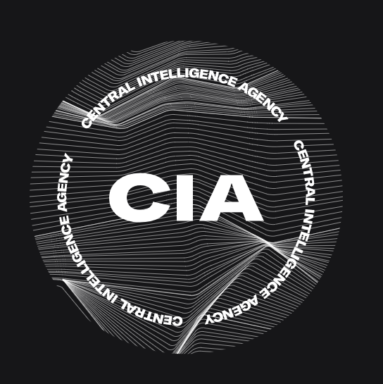
The first big rebrand of 2021 unexpectedly comes from the Although CIA’s revamped emblem still represents a roundel, it features an entirely new design, distinguished with wave-like patterns with multiple intersecting white lines against a gray background. It also includes the centered wordmark “CIA” and triple circular lettering “Central Intelligence Agency”. This is a really unusual design solution for such a solid governmental institution which previously used a seal in the style of the State symbols. This cliché-breaking move of CIA perfectly reflects the new recruiting and diversity policy, in which the organization aspires to enroll young and talented Americans…