Psychology of Design: How It Affects Players’ Behaviour
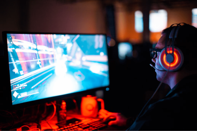
Design is important in identifying and developing patterns that build products; it helps with problem-solving. The challenge lies within the infinite complex combinations of people and contexts. In game design, players react to the same scenarios in various ways. Therefore, understanding their psychology is vital to engage players with fun experiences. This article will examine the key psychological factors in design and how the psychology of design affects players’ behaviour with examples of how the psychology of design is implemented. Psychological Factors The psychology of design is the various aspects and principles of design that can influence human behaviour. How…