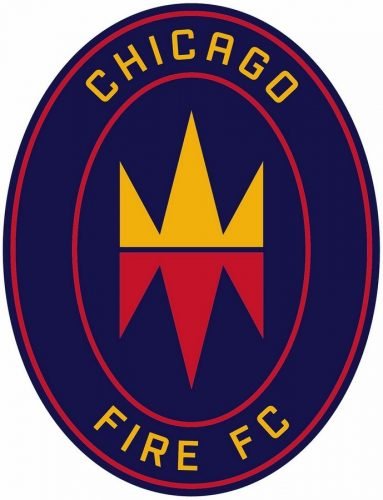
Blog

Varta updates its logo

Founded in 1887, Varta is a German company manufacturing batteries for global consumer, industrial and automotive markets. Celebrating the most successful recent year in its history, the brand has announced a new logo as well as a renovated brand strategy. The Ellwangen-based battery company is staying in the fast lane. With its record high share price and top income last year, Varta shows a great development dynamics even after 135 years since its inception, and now this success is getting an additional impact with a new emblem and an updated brand policy. While Varta has previously had the slogan “In…

Exploring the art of logos on miniature figures: Selecting the perfect symbol for your masterpiece

Step into the vibrant realm of miniature logo design, where each stroke of creativity breathes life into a small emblem, brimming with brand personality. The transition from a blank canvas of the figures to a intricately detailed logo to symbolize your figures is a captivating journey. Choosing the right elements is crucial; it’s not merely about adding visual elements but about expressing your brand identity through every line and curve. Let’s delve into the craft of discovering that ideal logo to elevate your brand symbol from a mere identifier to a work of art, and how to find miniature paints…

Pentagram designers create MIDI visual identity

The Musical Instrument Data Interface (also known as MIDI) is a technical standard connecting electronic musical instruments and digital devices. While the MIDI Manufacturer Association, a maintaining body for the technology, presented the MIDI 2.0 version last year, there was a need to update the MIDI visual identity as well. This task was delegated to Yuri Suzuki and Sascha Lobe who work in Pentagram. MIDI’s new brand identity, including a logo, typography and sound design, was influenced by the technology itself. The curves, that make up the central motif of the design, were inspired by sine waves which appear on…

Opel unveils an “electrified” visual identity

The fresh look started from the Opel GT X Experimental, a concept that was demonstrated two years ago and featured a new “Opel Blitz”, that has to mark the company’s upcoming cars, as well as the neon yellow in the roof side lines and wheels that was consequently taken as a brand color – this hue symbolizes electricity which will prevail as a car fuel in the new era. Later, the company presented the new Opel Mokka which was created in Opel’s brand-new style and distinguished with the Pure Panel new-gen cabin as well as the Vizor LED system. The…

Facebook updates Messenger’s logo in the Instagram style

It seems that Google is not alone in trying to unify the brands in terms of visual identity. This idea is likely supported by Facebook that has recently unveiled an updated logo for its Messenger app, as the design of the new emblem resembles the While the logo’s general forms, including the central bolt, have remained the same, the change concerns the logo’s coloring. Switching from blue to gradient of blue and pink with some orange hues, the icon really reminds of the colors of the Insta’s camera. Although an announcement from Facebook says nothing about the connection between the…

Reddit evolves as a brand through its new 3D logo and discussion-themed visual identity

In 2017, Reddit launched its mobile app, bringing a new brand positioning. Now, five years later, the company believes its users and the Internet at large have advanced considerably, so it’s time for the platform itself to do the same. And this is expressed in the new image of Snoo, the brand’s mascot, that has received a 3D design. The visual changes are intended to highlight the brand’s main distinctive feature: talks and discussions that take place on the platform. While emphasizing this aspect in a rather modern way, the new Reddit brand identity, according to the company, will hopefully…

AO: New smile, new style

Started from a bet between two close friends in 2000, AO (formerly known as Appliance Online) has grown into the largest online household appliance retailer in the United Kingdom. In the 2010s, the company was strongly expanding its activity in Germany, the Netherlands and France. Seven years ago, it rebranded as ao.com and received a logo featuring its lowercase initials and a semicircle that made it look like a smiling face. Although its visual identity was quite recognizable, the company felt that it’s a bit dated, making the business lost amid its competitors. To carry out a “long overdue facelift”…

How do the Logos and Brands Help to Grow the Business?

A brand is not only the product and label offered, but also the combination of all the visual components including the color palette, font, and the logo itself. In other words, a brand is the shell, the face of your business. People’s willingness to interact with you will depend on it since it’s the main indicator of uniqueness and personality. In today’s market, customers get exposed to new brands daily, so the logo has become a crucial part of the brand, as it works as a trigger for clients. A lot of brands fail to compete precisely because of their…

More