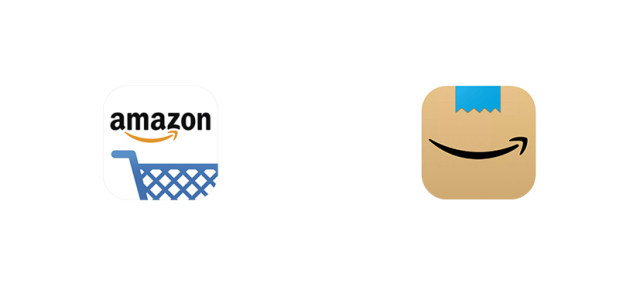
Blog

Spain’s La Liga is about to adopt a totally new logo

According to the information leakage published by the sports edition FootyHeadlines, the While the current version of the La Liga logo was introduced in 2016, the change of the identity is said to be planned by the championship’s board in connection with the change of the sponsor as EA Sports is coming instead of Santander. The source also says the emblem has already been finalized. The football enclosed by seven patches in the colors of the rainbow was first introduced in 1993 and slightly redesigned in 2016. Now, it will likely become history. As for the leaked badge, it will…

Mozilla releases Firefox v.70.0 with new security tools and logo

Rich functionality and regular updating made Firefox the second web-browser after Google Chrome in the ranking of popularity. Recently, Mozilla has released the 70th version of the application. Now, the updated Firefox featuring such new functions as Blocking cryptomining and Enhanced Track Protection comes with a renewed logotype. While most companies tend to hide their plans about a new identity, Mozilla chose to be totally transparent. The company shared the ideas it was creating in cooperation with three independent design teams allowing the user community take part in the process. According to Tim Murray, Mozilla’s artistic director, Firefox is more…

Port Adelaide presents a commemorative logo with a touch of controversy

To mark its 150th anniversary, Australian football club Port Adelaide has introduced a new logotype. It will appear on PA’s AFL and SAFL team uniforms in the 2020 season. The club’s new insignia features the interlacing “P” and “A”, 1870, the foundation year and a black-and-white chevron as a sign of the guernseys worn in both leagues. The logo was presented at the Pirate Life brewery, where over 2000 PA’s fans gathered. According to David Koch, the club’s chairman, it is a result of Port Adelaide’s collaboration with a lot of people including focus groups, design agencies as well as…

Independence of Baker Hughes is marked by a new identity

A while back Baker Hughes introduced its new identity. Baker Hughes belongs to one of the leading and oldest oil field services companies, working in the sphere for around a hundred years with headquarters in more than 120 countries. Apart from providing services, the company specializes in producing equipment and software for the industry. The redesign was caused by recent Baker Hughes’ separation from The new corporate logo will appear on the BH buildings in all its branches worldwide in 2020. Working cloth for field workers, including hard hats, will feature the doubl-arrow emblem too. Moreover, the company is willing…

Disney+ unveils new green logo called Aurora

Disney+ has officially presented its new logo, different from what the service’s subscribers are accustomed to seeing. The branded blue color has been changed to a greenish hue reminding the colors of Hulu, a service which will soon be integrated into Disney+. Judging on users comments online, the remake appeared to be a controversial thing. Some see it as a pointless simplification, while others appreciate the uniqueness of the design, compared to other streaming services. And there are also those who ask if the color is really changed or they just didn’t pay attention to it. Actually, the new version…

City Of Moose Jaw Updating Its Logo And Website, And Launching A New App

The City of Moose Jaw, the Saskatchewan province, Canada, is planning an update of the city logo in 2020, as well as modernizing its website along with the new application launch. The 4th largest city in the province is situated on the bank of the Moose Jaw River and near the Trans-Canada Highway 48 miles (71km) west of Regina. Craig Hemmingway, Communications Manager for the City, lifted the veil of the new look of the future version of the logo. According to C. Hemmingway, the new logo, as well as the old one used to, will without doubt include the…

Hudson: new identity for traveler’s best friend

Established in 1918 as a company delivering newspapers and magazines, Hudson has eventually evolved into a large travel retailing enterprise that includes about 1000 duty-free shops and newsstands in 87 airports across North America. Its staff numbers almost 10,000 employees.   Expanding the business, the company, affiliated to the Swiss brand Dufry, has recently carried out a rebranding by dropping the word “Group” from its name and introducing a new logo. Hudson’s new identity is itented to showcase its rich history and reflect the policy aiming to modernize its services for travelers in airports. The company’s updated look was developed…

Warner Bros. unveils a revamped logo by Pentagram

Warner Bros. needs no introduction. Everyone knows and loves the movies and cartoons that start with its famous WB shield. In 2023, the studio is going to celebrate its 100th anniversary. So, moving towards to this event, it is thinking of refreshing its identity. Although the WB emblem is quite recognizable and tells a lot about the company’s heritage, Warner Bros. still feels the need to meet the requirements of the modern times including the branding issues. For a rebranding, the company applied to Pentagram, a renown design studio that collaborated with many companies working in different spheres. Pentagram has…

More