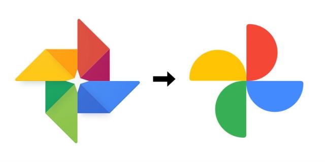
Blog

Foursquare updates its brand identity

Launched in 2008, To overhaul its look Foursquare hired PlayLab, a Los Angeles-based design studio, that developed the service’s new identity based on its activities and current level in terms of business and technology. While the previous Foursquare logos looked quite generic, featuring a cartoon character or representing a simple lettering (in the latest iteration), the updated visual identity of the service includes a new wordmark in the Authentic Sans 90 typeface, complemented by the FSQ abbreviation. As David Godycki, the art director of Foursquare, says, this design creates a scalable system retaining the company’s traditional playful style. In addition,…

The Scouts: Be prepared for new design

The Scout Association is the largest Scouting organizations in the United Kingdom. It unites over 580,000 members and can boast its rich history. Regardless of its heritage, changing times urge this movement, offering education for young people, to update its identity. Established in 1909, the Scouts had kept the traditional fleur-de-lis on their logos, the latest of which was introduced almost 20 years ago that certainly allows to consider it as dated. In the modern digital age, the leaders of the organization have realized that the Scouts identity has to be changed. As Chris James, a brand director at the…

Italia’s Azzurri are about to start new season with new identity

At the beginning of the year, Federazione Italiana Giuoco Calcio (Italian Football Federation) announced a new identity for the Italian National Football Teams, including a logo and even a sound logo. The new symbols will officially be adopted in March. According to FIGC, the refreshed shield is “an expression of the feelings and the passion of the Italian football fans”. The Azzurri, the national football team, will present it to the wider public in the opening matches of the qualifying round for the 2024 Euro which will be held in Germany. The redesign also coincides with the fact that the…

Brighton & Hove Museums: United with the ampersand

Formerly named Royal Pavilion & Museums, Brighton & Hove Museums is a governing body for six historic and artistic sites located in Southern England. Changing its name, this part of the Brighton & Hove Council has adopted a new visual identity focusing on the ampersand as a symbol of unity and inclusiveness. Actually, the Brighton & Hove Museums branding project started from the update of the organization’s website. Baxter & Bailey, a local design studio that was commissioned for it, proposed to completely renovate the look of BHM with proper architecture and visual guidelines. As Brighton & Hove is the…

French search engine Qwant unveils new logo

Launched in 2013, Qwant is a French search engine which is mainly used in France and other francophone countries. The website doesn’t generate income from advertising. Instead, it is funded by providing its technology to other websites and businesses. In this regard, Qwant doesn’t employ user tracking or personalize search results. The brand has recently updated its design to express its revised ambitions and aspirations for being more available and modern. Initiated by financier Jean-Manuel Rozan and computer security specialist Éric Léandri, Qwant, which generates almost two-thirds of search queries in France, rolled out its new design coincided with the…

Bank of England refreshes its Britannia logo

Established in 1694, the Bank of England is one of the world’s oldest financial organizations. Recently, the institution has revised its corporate identity as a part of the “Digital First” strategy. According to the bank’s representatives, the new design has become more inclusive and understandable, meeting the requirements for modern communications. The Bank of England is a central bank of the United Kingdom, and as such, is a central institution for the monetary policy and the monetary system in the financial sector. The most important task of BoE is to provide price stability for supporting the purchasing power of the…

Anheuser-Busch InBev: Cheering redesign

Last month, Anheuser-Busch announced its new global goal, beginning to hold a customer-oriented strategy under the motto “We Dream Big to Create a Future with a More Cheers”, which has to drive further growth. While betting on this, the St. Louis-based company has unveiled its new look. According to AB, the revamped visual identity better reflects the things the company is advocating for, and where it wants to move to. Showing off simple and contemporary motifs, the design perfectly fits the company’s ambitious and optimistic spirit, celebrating the great plans of Anheuser-Busch, as the group’s global brands vice-president Richard Oppy said….

Twitter founder’s company Square rebrands to Block

Established by The company reported its upcoming rebranding in its Twitter account, saying “Not to go all meta on you… but we’re going to!”. While it was, for sure, a playful nod to the recent renaming of Facebook to Meta, the renewing of Square itself is likely connected with the fact that Dorsey lately resigned as CEO of Twitter, probably having great plans for his other invention. As Block, besides financial brands, runs some other businesses in the entertainment and cryptocurrency sectors, the new name has to reflect the company’s new positioning as an overarching ecosystem. The word block, the…

More