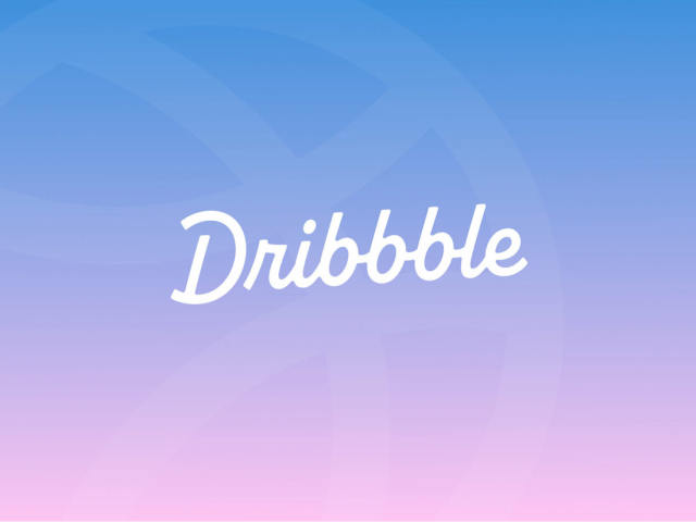
Blog

Ferrari rolls out its 75th anniversary logo

As For the 75th anniversary emblem, Ferrari’s iconic prancing horse was incorporated into the big number “75” accompanied by the dates “1947-2022”. The logo is designed in red and white which are traditional colors of the brand, associated with Ferrari sports cars. It will be displayed at the special events the company will organize throughout 2022. The “Cavallino Rampante” was also embodied into a sculpture made up as a puzzle by Ferrari specialists. It symbolizes the essence of Ferrari as well as the history and future of the brand, as the company’s chairman John Elkann said. 2022 is not just…

Costa Crociere presents sustainable logo

The Italian cruise line According to Costa Crociere, it has updated all its offerings, emphasizing the “steadfast exploration of the travel directions”. The innovations are so important that it deals with a totally new way of traveling. In the future, Costa will focus on three key activities: tours, cuisine, sustainability. The concept is consistent with the principles of the travel industry’s declaration of value-oriented, stable and comprehensive tourism. All of this is reflected in the company’s new branding. Costa’s ships have been marked with a “C” on their funnels for more than 70 years, and the latest time when the…

Edmonton Eskimos rebranded as Edmonton Elks with new logo

The Edmonton Eskimos, playing in the Canadian Football League, have rebranded as the Edmonton Elks. Renaming themselves, the team meets numerous requests from indigenous people’s organizations arguing that the “Eskimo” has a controversial connotation. Alongside the new name, a new logo has been presented as well. The rebranding process began last November when then called Eskimos launched an online campaign, asking people to choose a new name for the team. In four months, a list with more than 2000 proposed names was shortened to seven. A final survey among the club’s players, couches, stakeholders and fans, with some advice from…

Flower City Union gets logo

Last December, the National Independent Soccer Association announced the league would be joined by a team from Rochester, NY, named Flower City Union. Getting ready to start playing in the 2022 season, the soccer team has recently presented their logo created by Christopher Payne. As the Rochester Rhinos, who played in the United Soccer League, indefinitely took a break in 2017, the city was left without a professional soccer team. So, several enthusiasts for the game, including the Rhinos’ former chief business officer, decided to resume soccer life in Rochester, founding the Flower City Union. The team draw their name…

When Pixels Influence Profits: The Intertwining Paths of Branding and Cryptocurrency Exchanges

In a world where digital platforms battle fiercely for attention, the branding of a cryptocurrency exchange is not just about good looks. It’s a subtle dance of psychology, trust and market presence. Let’s dive into how the visual identity of these digital marketplaces plays a crucial role in their success, and yes, this includes keeping an eye on the updated Bitcoin price. Exploring the visual evolution of cryptocurrency exchanges From their nascent days, cryptocurrency exchanges have undergone a significant transformation. Initially, the focus was purely on functionality, often at the expense of user interface (UI) and experience (UX) design. Early platforms…

Swarovski adopts new visual identity, openning new stores worldwide

Crystal brand First of all, the fresh design’s leitmotif can be seen in the updated Swarovski logo. The iconic swan in the new iteration is facing to the right, featuring a more elongated neck and two wings, more clearly drawn compared to the old one-wing version. The brand chose the swan as its emblem in 1988 as a symbol of everlasting love and nature’s beauty, the notions that have always been associated with Swarovski’s crystal glass and jewelry. For the logo, the swan has been placed into an octagonal frame that symbolizes a faceted crystal as well as the idea…

National Landscapes: Vivid mosaics

Many of the most beautiful landscapes in the United Kingdom are currently protected and supported by the National Association for Areas of Natural Beauty (AONB). The AONB status enables local and national authorities to combat biodiversity loss and, ultimately, global warming. However, the complex names associated with these protected sites have hindered effective communication. Recent research conducted by the governing organization revealed that only half of the British population is aware of these amazing places, despite two-thirds of them living within a 30-minute distance. In light of this, the association has undertaken a comprehensive design process to update its visual…

Liberty Travel presents a new logo celebrating its roots

Established in 1951, Liberty Travel is a travel and cruise company that, from its beginning, pioneered in offering transportation, hotel accommodation and other services for a single price. The company’s service and pricing innovations made traveling more affordable not only for the wealthy, but also for ordinary people. While going to celebrate its 70th anniversary next year, the agency has unveiled a new logo paying tribute to its heritage. Although Liberty Travel is now headquartered in Montvale, New Jersey, it started from an office in New York’s Time Square. These are its roots and connection with New York the company…

More